Artblog
Design, typography, colour and photography, with the history of Indian art and design along the way.
The blog of Kala (The Studio). Kala means art. Written by Sapta.
78 posts9 kinds133 interactive charts and calculators147 forum questions answered
Start with these
Find a post
78 posts. Search, or pick a kind of post to see more.
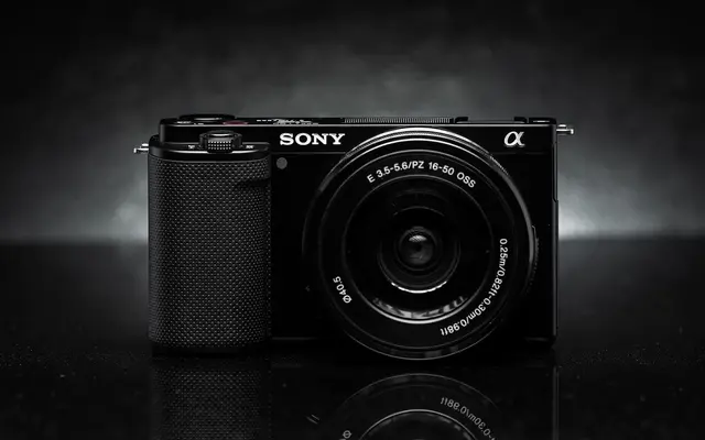
Sony ZV-E10 review: an owner's take for motorcycle filmmakingA 24 MP APS-C sensor and real lens choice for under a lakh, with one catch that matters on a bike: a 33 ms readout that bends anything moving fast.Questions answered13 min read
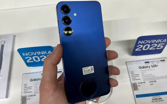
Samsung Galaxy S25+ as a travel camera: owner reviewI carry a Galaxy S25+ next to a mirrorless camera and an action cam. Here is what its three lenses really cover, what a motorcycle mount can do to it, and when Galaxy Log is worth the trouble.Questions answered14 min read
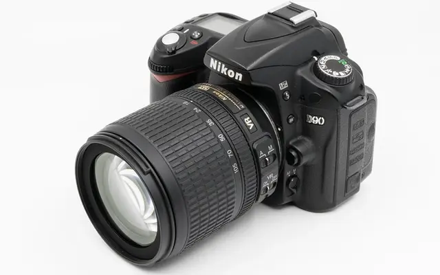
Nikon D90 in 2026: is a 2008 DSLR still worth shooting?The first DSLR that shot video is now an 18-year-old stills camera. What still holds up, what has aged, and what to check before you buy one used.Questions answered11 min read

Editing travel films on a 2019 ROG Strix G15 (GTX 1650): owner reviewA 2019 gaming laptop with a 4 GB GTX 1650 can still cut a multi-episode travel series. The decoder handles the camera files; the 4 GB of VRAM is the wall, and the workflow has to be built around it.Questions answered12 min read
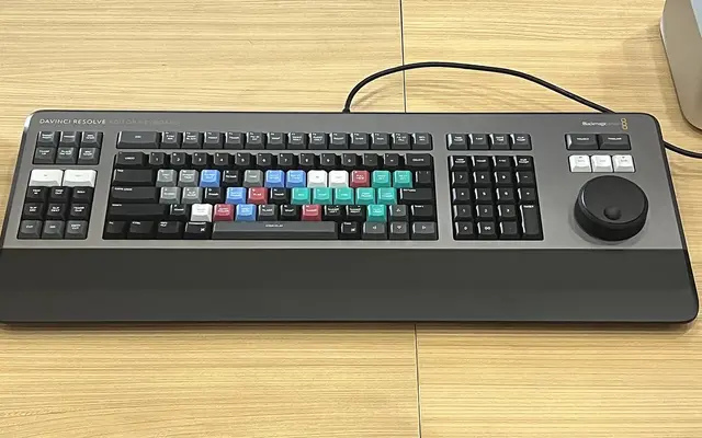
DaVinci Resolve Studio: is the paid version worth it?The free DaVinci Resolve already edits 4K at 60 fps. Studio costs ₹25,980 on sale. Here is exactly what the money buys, which camera files actually need it, and a 30-minute test to decide before you pay.Guides12 min read
DJI Osmo Action 4 for motorcycle POV: an owner's reviewA 1/1.3-inch sensor, 10-bit D-Log M and a magnetic mount make it a strong riding camera. Wind, cold batteries and where you mount it decide whether the footage is usable.Questions answered14 min read

Your eye and a camera both lie in the same placesYour eye has a hole in it, guesses most of its colour and repaints every shadow. So does your camera. The three places they both fail, the arithmetic of how each one hides it, and the one place they part ways.What ifs12 min read

Why is 50mm the standard lens? The history and the mathsThe 35 mm frame's diagonal is 43 mm, not 50. The 50 mm lens won through Leica's 1925 choice, cheap fast double-Gauss designs and the distance people hold a print.Questions answered12 min read
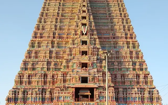
Why a temple gopuram and a good slide deck are built the same wayA 73-metre gopuram has to work from a kilometre away and from arm's length. So does a slide, from the back row and from the front. The maths of visual angle shows they solve one problem with one structure: layers of detail, each sized for a distance.What ifs13 min read

What is wrong with Comic Sans? The answer, with researchComic Sans was drawn in 1994 for cartoon speech balloons, then shipped to every PC on earth. Designers object to its spacing and its misuse; the research on reading and dyslexia says something more interesting.Questions answered16 min read

What if you took photos on Mars? Light, dust and colourMars gets 43% of Earth's sunlight through a sky full of dust, so your exposure drops about two stops and your colours go wrong. NASA's answer is a small colour chart bolted to the rover, and the maths behind it.What ifs14 min read

What if you took a selfie from a billion kilometres away?From a billion kilometres, all of Earth fills about one pixel of a Voyager-class camera. To see yourself you would need a lens over 1,300 km wide. Or you could cheat with a laser and become the brightest point on the planet.What ifs14 min read

What if you painted a rangoli on every kilometre of Indian highway?One rangoli per kilometre of national highway is 1,46,560 rangolis, a few hundred tonnes of powder and an army of hands. The first truck arrives in seconds. Here is the full working, and the version that would actually last.What ifs15 min read

What if you had to design a logo that lasts 10,000 years?Governments have actually commissioned this, to warn future people away from buried nuclear waste. The maths of erosion, language change and redundancy shows why no single logo can do it, and what can.What ifs14 min read

What if humans could see ultraviolet and infrared?Ultraviolet is one lens away, and some people already see it. Heat vision is a different story: the physics of a warm eye says a pigment for it would fire on its own, thousands of times a second.What ifs17 min read

What if every camera on Earth vanished?The world would lose about 5.7 billion pictures a day, and memory, news and courts would fall back on drawing and description. The optics say it could not last a week.What ifs14 min read

What if Raja Ravi Varma had a camera and Photoshop?He already worked from photographs, posed his own daughter and once dressed in a sari for a reference shot. The numbers show a modern camera and layers would have sped up his studio and his press, not changed what he made.What ifs13 min read

Vector vs raster: which format to use for logos and printVectors store shapes as maths, rasters store a fixed grid of pixels. Logos, type and line art belong in vector; photographs can only be raster. Here is how to pick the file.Questions answered11 min read

Truck art and app icons solve the same problemThe painted back of an Indian truck at 75 metres and an app icon at arm's length land on your retina at almost exactly the same size. Both must be found and recognised in a fraction of a second among dozens of rivals. Here is the maths of visual angle and visual search that links them.What ifs12 min read

Shutter speeds to freeze motion: 8 subjects rankedFreezing a subject is geometry, not guesswork: speed, distance and focal length decide the shutter. Here are eight common subjects worked out, from a walking friend to a 140 km/h cricket ball.Top lists15 min read

Is Pantone still worth it in 2026? Spot colour explainedPantone is a shared language for mixed inks, not a colour space. Whether you need it depends on your print process, your brand colour and how many runs you will print.Questions answered12 min read

How to design a logo: a step-by-step process from brief to fileA logo is a small engineering problem: it must be recognisable at 16 pixels and on a 40-foot hoarding, distinct in its category, and legally yours. Here is the process I use, step by step, with the tests that catch weak marks early.Guides13 min read

How to build brand guidelines: a template for small teamsA brand book doesn't need 120 pages. Here is a lean template in eight sections, with the numbers each one must contain, modelled on NASA's 1975 manual, the GOV.UK Design System and India's own DBIM.Guides11 min read

How to build a design portfolio without clients or a degreeHiring managers skim for thinking, not for logos of famous clients. Here is how a self-taught designer builds three to five case studies from scratch, without fake rebrands, and gets them seen.Guides14 min read

Brand colours of India's most valuable brands, countedI pulled the logo files of 14 brands from Kantar's 2025 India ranking and counted the colours. Blue wins by a distance, red is a distant second, and the reasons are more about category than culture.Top lists11 min read

A sari and a sports bike are both exercises in the same curveA draped pallu and a superbike's flank are both drawn by the same law: a bent elastic strip settles into the curve with the least bending energy. Here is the maths that links six yards of silk to a Ducati fairing, and where the link snaps.What ifs13 min read

A kolam is a line you can't lift your hand from, and so is a good logoWhether a drawing can be made in one unbroken stroke is not a matter of skill. It was settled by Euler in 1736, and every sikku kolam obeys his rule. Here is the theorem, the count of how many kolams exist, and what it really says about logos.What ifs12 min read

8 Indian logo redesigns in order, and what changedFrom Airtel's 2010 wave to Instamart's 2025 switch to blue: eight Indian rebrands in date order, what each changed in mark, type, colour and name, and the reason the company gave.Top lists13 min read

10 Indian photographers who shaped how India is seenFrom a Roorkee-trained draughtsman photographing the Nizam's Hyderabad to a Prix Pictet winner working with families in the Rajasthan desert: ten famous Indian photographers in order of birth, with the work and the archive to look at.Top lists14 min read

Why logos look dated, and what the logo redesign wave teachesEvery era stamps its software on its logos: bevels, gloss, flat, and now glass. The marks that last avoid the fingerprint and own a shape and a colour.Good reads12 min read

White balance explained: how Kelvin and your eyes disagreeWarm light has a low Kelvin number, your camera's 3200 K setting makes pictures bluer, and your eyes quietly fix colour casts that the sensor records faithfully. Here is the physics, the perception and the algorithms behind white balance.Technical13 min read

What really controls depth of field: aperture, distance, sensorDepth of field has four inputs, not one: f-number, focus distance, focal length and an agreed blur limit set by sensor and viewing size. Put numbers on all four and the myths about crop sensors and phones sort themselves out.Technical13 min read

What if your camera were the size of a building?Someone already turned an aircraft hangar into a pinhole camera. The physics of that 6 mm hole shows why a building-sized camera is barely sharper than a shoebox, and what you would have to add to beat it.What ifs16 min read

What if you left the shutter open for a thousand years?Film would burn out in seconds and a sensor would drown in its own noise. The one medium that works is fading paint, and the light-dose maths shows what a millennium would actually draw.What ifs15 min read

What if you could only shoot one focal length for a year?One lens, 365 days. The geometry says you lose less than you fear, the crop maths says exactly what it costs, and the research on constraints says why it often makes the pictures better.What ifs15 min read

What if the world had only one colour? How you would still seeLight the world with a single wavelength and two million colours collapse into a few hundred greys. The maths of cone signals, and people who already see this way, show you would keep shape and depth and lose surprisingly specific things.What ifs13 min read

What if all the world's design were done by AI?Experiments say AI makes each design a little better and all designs a little more alike. Run that for a few model generations and the maths of model collapse shows where the world's visual culture would end up.What ifs14 min read

What if a photo had a trillion megapixels? The physics limitA trillion megapixels is 10^18 pixels: enough to photograph the whole Earth at 2.3 cm per pixel. Diffraction says the lens alone would be 390 metres wide, and that is before the data bill.What ifs13 min read

Typographic grids: baseline, modules and Müller-BrockmannA grid is not twelve columns you drag onto a frame. It is arithmetic that starts with the leading of your body text. Here is the maths, the Swiss method behind it, and how it maps to CSS Grid.Advanced15 min read

The golden ratio in design: myth, maths and what's realThe Parthenon was not built on 1.618, nobody reliably prefers golden rectangles, and the spiral on your logo overlay is not even golden. Here is what to use instead.Good reads13 min read

The exposure triangle explained in stops, not metaphorsAperture, shutter and ISO are three ways of spending one currency, the stop. Count in stops and the triangle stops being a metaphor and becomes arithmetic you can check.Technical13 min read

The Eames India Report, 68 years on: what it got rightIn April 1958 two American designers handed the Government of India a short report built around a brass water pot. It created NID. Read today, its best ideas are still ahead of Indian design practice, and its blind spots are instructive.Good reads13 min read

The Bengal School: Abanindranath, Nandalal and swadeshi artA British principal, a Tagore nephew and a schoolteacher's son from Munger tried to paint an Indian alternative to the academy. It worked for thirty years, then turned into design.History13 min read

The Amul girl: 60 years of a hand-drawn topical adA polka-dot moppet drawn in 1966 to sell butter became India's longest-running running joke, and the reason is a design system, not luck.Stories14 min read

Street photography in India: how to shoot people with respectA 28–35 mm lens, a pre-set focus zone, exposure set for the midday glare, and a clear rule for when to ask first. Plus what Indian law and the DPDP Act actually say about photographing strangers.Guides15 min read

Shooting RAW for dynamic range: ETTR, histograms and curvesRaw files are linear, so the brightest stop holds half of all tonal values and the darkest holds almost none. That one fact explains expose-to-the-right, why your histogram lies, and when ISO stops mattering.Advanced15 min read

Self-taught graphic designer in India: what school doesn't giveSoftware is the easy part. What a design programme really sells is critique, history and a network, and a self-taught designer has to build all three on purpose.Good reads12 min read

Satyajit Ray the designer: covers, posters and typefacesBefore he made Pather Panchali, Satyajit Ray spent 13 years in an advertising agency and designed some of the best Indian book jackets ever printed. He never stopped designing: his own posters, his own titles, his own typefaces.Stories12 min read

Raja Ravi Varma's press: how oleographs reached every homeA painter for maharajas bought a German steam press, hired a Berlin printer and sold his goddesses for two rupees. Within a generation, his Lakshmi was how India pictured Lakshmi.Stories12 min read

Raghubir Singh: the photographer who saw India in colourWhen serious photography meant black and white, a Jaipur-born photographer loaded slow colour slide film and argued that Indians had never seen in monochrome. The story of Raghubir Singh, and the case against him.Stories12 min read

RGB vs CMYK: why your colours change when you printA screen adds light and paper subtracts it, so the two can never show the same set of colours. Here is how big the gap is, in numbers, and what Indian presses will actually print.Technical13 min read

Phone photography that looks like a camera: a practical guideSeven habits that move phone photos from snapshot to deliberate picture, each tied to what the phone's burst pipeline is actually doing when you press the shutter.Guides14 min read

Perceptual colour for design systems: why OKLCH beats HSLIn HSL, pure yellow and pure blue both have 50% lightness, yet one is nearly white to the eye and the other nearly navy. OKLCH fixes that, and with it most of the pain of building tonal ramps and accessible palettes.Advanced14 min read

NID Ahmedabad history: how India built its first design schoolFrom a three-month Eames tour in 1958 to an Act of Parliament in 2014: how the National Institute of Design was invented, staffed and copied across India.History14 min read

Mughal miniature painting: the karkhana and its mastersHow two Persian painters, an emperor who could not read and a workshop of a hundred artists built India's most refined school of painting in about 80 years.History12 min read

Motorcycle travel photography: gear, mounts and shooting on tourA motorcycle is a vibrating, dusty, freezing camera bag on two wheels. Here is how to carry, mount and use cameras on a tour without breaking them, with the physics of vibration, panning and cold batteries worked out.Guides17 min read

Madhubani and Warli: a history of two Indian folk artsOne was a wedding-room mural in Bihar, the other a ritual drawing on a Maharashtra hut wall. An earthquake, a drought and one painter's career turned both into national brands.History13 min read

Lens compression explained: focal length vs distanceTelephoto lenses do not squash mountains together. Your feet do. Here is the geometry, the face research and what it means for phone zoom.Advanced14 min read

Kerning, tracking and leading: how spacing type really worksKerning fixes one pair of letters, tracking changes every gap, leading sets the distance between lines. I opened five open-source font files to show the actual numbers behind each.Technical14 min read

Kalighat painting: the bazaar art of 19th-century CalcuttaVillage scroll painters moved to a temple lane in Calcutta, sold gods and gossip to pilgrims for a few paise, and invented the city's first popular visual culture.History11 min read

Indian truck art: what Horn OK Please teaches designersThe back of an Indian truck is a working design system: fixed zones, a shared vocabulary of motifs, loud colour and hand lettering built to be read at 60 km/h.Good reads13 min read
How to use AI in a design workflow, step by stepAI is fastest at the parts of design that were never the hard part. A human-directed, AI-built workflow puts the brief, the type and the final call with you, and uses the models for breadth, with the rights and provenance checks that 2025-26 law now expects.Guides15 min read

How the ₹ symbol was designed: the 2010 rupee sign contestA public contest with 3,331 entries, a postgraduate student from IIT Bombay, a Cabinet vote and a Unicode code point in 89 days. The making of the rupee symbol, and what it took for every keyboard to catch up.Stories15 min read

How phone cameras compute a photo: HDR stacking and night modeYour phone does not take one picture. It takes a burst, throws away what moved, averages the rest and then paints the tones back in. Google published the recipe; here it is with the numbers.Technical16 min read

How Devanagari fonts work: conjuncts, matras and OpenTypeA Latin font maps one key to one letter. A Devanagari font has to rebuild every syllable: reorder vowel signs, fuse consonants and hang them from a headline. I opened four Hindi fonts to count what that takes.Technical13 min read

Homai Vyarawalla, India's first woman press photographerShe was paid a rupee a picture, signed her work with a car number plate, developed film in her pantry, and photographed the handover of power from the Raj. Then in 1970 she put the camera down for good.Stories12 min read

Hand-painted Bollywood posters and signs: a craft's historyFor seventy years Indian cinema sold itself with paint: posters painted on canvas and photographed, hoardings painted by hand on scaffolding. Then digital design and flex printing ended it in about a decade.History13 min read

Free Hindi fonts: 10 Indian-script families ranked by coverageMost free Indian fonts cover one script. These ten open-licence families on Google Fonts cover the most, ranked by scripts first and weights second.Top lists12 min read

Does the rule of thirds work? Composition rules, testedThe rule of thirds is a 1797 painter's tip about light and sky, not a law of beauty. Experiments find people often prefer the centre, and great photos rarely sit on the lines.Questions answered12 min read

Do megapixels matter? Sensor size, pixels and real detailTwelve megapixels already fill an A4 print at 300 ppi. Past that, lens diffraction, pixel size and light decide how much real detail you get.Questions answered12 min read

Designing bilingual Hindi-English layouts that balanceSet Hindi and English at the same point size and one always looks wrong. I measured nine Google Fonts families to show why, and how to size, space and grid the two scripts so they read as one voice.Advanced13 min read

Colour contrast beyond WCAG 2: APCA, luminance and readingThe 4.5:1 rule passes black text on bright blue and fails white text on orange that most people read more easily. Here is why the maths does that, what APCA changes, and what WCAG 3 has actually decided.Advanced15 min read

Best camera phone in 2026, ranked by DXOMARK scoreThe ten highest DXOMARK camera scores under the current V6 protocol, with each phone's sensors and lenses, what the number measures, and where it misleads.Top lists13 min read

Are serif fonts easier to read? What the research saysA century of reading studies finds no reliable winner between serif and sans serif. Size, x-height, spacing and the individual reader matter far more.Questions answered14 min read

Ajanta cave paintings: dates, pigments and survivalTwo bursts of painting four centuries apart, a mud plaster mixed from the river below, lapis from Afghanistan, and two hundred years of copying that did as much harm as time.History13 min read
AI in graphic design 2026: what tools change and what they don'tGenerative tools made variation nearly free. They did not make judgement, systems or type any cheaper, and the copyright rules say so too.Good reads12 min read

7 UNESCO Indian art heritage sites, ranked by ageFrom Bhimbetka's painted rock shelters to Hampi's granite chariot: seven World Heritage sites that hold India's painting and sculpture, ranked by when their art began.Top lists14 min read
10 most expensive Indian paintings ever sold at auctionRavi Varma at ₹167 crore, Husain at $13.75 million, a Mughal cheetah at £10.2 million: the ten highest auction prices for Indian paintings, and what actually drives them.Top lists14 min read
Nothing matches that. Try a shorter word.