The WCAG 2 colour contrast ratio compares the relative luminance of two colours as (L1 + 0.05) / (L2 + 0.05) and asks for 4.5:1 for body text. It is symmetric, ignores text size beyond a "large text" switch and treats dark-on-light and light-on-dark as equal, so it overrates mid-tone pairs such as black on bright blue and underrates white on saturated orange. APCA, the candidate method for WCAG 3, instead estimates perceived lightness contrast with separate curves for each polarity, but as of the September 2026 WCAG 3 draft, the contrast algorithm is still officially undecided.
- 4.5:1 is the WCAG 2.2 AA floor for body text, and it is still the legal benchmark.
- White on #FF6600 fails WCAG 2 at 2.94:1, yet APCA rates it higher than black on the same orange.
- APCA Lc 75 is the Bronze minimum for body text; Lc 90 is preferred.
- WCAG 3 (September 2026 draft) has still not chosen a contrast algorithm.
- 83.9% of the top million home pages had low-contrast text in WebAIM's 2026 scan.
This post is for designers who already run every pair through a checker. The point is not to throw WCAG 2 away; it remains the legal benchmark in most places, and the European Accessibility Act made it enforceable for many products from 28 June 2025.
The point is to know where the formula is weak, so you stop shipping colours that pass the test and fail the reader.
On 14 April 2019, Andrew Somers, a film and television colourist, opened an issue on the W3C's WCAG GitHub repository titled Contrast Ratio Math and Related Visual Issues. His examples were blunt: white on mid-grey #808080 scores about 4.6:1 and passes, while #808080 on near-black #040404 scores roughly 179:1. On his test page, some pairs rated 2.9:1 (a fail) read more easily than pairs rated 4.5:1 (a pass).
W3C participants pushed back. One said the group picked 4.5:1 partly so that both black and white text could pass on mid-grey. The thread grew to more than a hundred comments, Somers became an invited expert and went on to build APCA, and the issue was moved to the WCAG 3 repository in January 2025, still open.
W3C WCAG on GitHub: Contrast Ratio Math and Related Visual Issues (issue 695)How is the WCAG 2 contrast ratio actually calculated?
WCAG 2 linearises each sRGB channel, weights them into relative luminance Y, then divides the lighter luminance plus 0.05 by the darker plus 0.05. The result runs from 1:1 (same colour) to 21:1 (black and white).
- Normalise. Divide each 8-bit channel by 255.
- Linearise. If the value is at or below 0.04045, divide by 12.92; otherwise compute ((C + 0.055) / 1.055)2.4. The WCAG 2 text printed 0.03928; the W3C's own errata note says 0.04045 matches the IEC sRGB standard, and the difference does not matter for 8-bit colours.
- Weight. Y = 0.2126 R + 0.7152 G + 0.0722 B. Green carries 72% of luminance and blue just 7%, which is why pure blue (#0000FF) has Y = 0.072 and pure yellow has Y = 0.928.
- Ratio. (Ylighter + 0.05) / (Ydarker + 0.05). The 0.05 stands in for screen flare and ambient light.
The thresholds in WCAG 2.2 (whose current W3C edition is dated 12 December 2024) are short:
| Success criterion | Level | Normal text | Large text (18 pt, or 14 pt bold) | Non-text |
|---|---|---|---|---|
| 1.4.3 Contrast (Minimum) | AA | 4.5:1 | 3:1 | None |
| 1.4.6 Contrast (Enhanced) | AAA | 7:1 | 4.5:1 | None |
| 1.4.11 Non-text Contrast | AA | None | None | 3:1 for UI components and needed parts of graphics |
What the formula leaves out
- Font weight counts only at the 14-point-bold switch, so thin 300-weight text at 16 px gets the same target as heavy 700-weight text.
- Polarity is ignored, because the ratio swaps the two colours so the lighter one is always on top.
- Hue enters only through the luminance weights, so two very different colours of equal Y look identical to the test.

Why does the WCAG 2 contrast ratio fail white on orange?
White on #FF6600 orange scores 2.94:1 and fails, while black on the same orange scores 7.15:1 and passes AAA, yet many readers find the white version easier to read. The formula sees a bright, high-luminance orange and concludes dark text wins; human vision at text sizes responds more to lightness contrast shaped by polarity and the surround.
The orange-button complaint
This is the exact complaint in a Graphic Design Stack Exchange thread: two orange buttons, the black-text one scores far higher, but the asker finds the white one easier. The most-voted answer comes from Andrew Somers, who developed APCA and joined the W3C work as an invited expert after raising the issue in April 2019. He argues the WCAG 2 maths is not perceptually uniform and works best when the background is very light, while mishandling reds, oranges and dark mode.
Treat that as an informed, interested view; independent tests are still thin, which I come back to below.
Why a ratio misleads near black
The deeper reason is the 0.05 flare term and the ratio itself. A ratio treats a change at the dark end the same as a proportional change at the bright end, but our perception of lightness is closer to a cube-root or power curve. Near black, small luminance differences produce big ratios that look tiny on screen. That is why WCAG 2 is generous to dark pairs.
A pair can pass the WCAG 2 test with both black and white text and still be readable with only one of them.
What are the pairs that pass one test and fail the other?
Mid-tone colours are where WCAG 2 and APCA disagree most: pairs that clear 4.5:1 can sit far below APCA's body-text level, and some pairs that fail 4.5:1 sit comfortably above APCA's level for larger text. I computed the table below with the WCAG 2.2 relative luminance formula and the APCA 0.0.98G-4g base constants.
| Text on background | WCAG 2 ratio | WCAG 2 AA body text | APCA Lc | APCA Bronze reading |
|---|---|---|---|---|
| Black on #0077CC blue | 4.51:1 | Pass | 32.5 | Below every Bronze text level |
| White on #0077CC blue | 4.66:1 | Pass | -77.1 | Meets body-text minimum (Lc 75) |
| Black on #FF6600 orange | 7.15:1 | Pass (AAA) | 49.3 | Large text over 32 px only |
| White on #FF6600 orange | 2.94:1 | Fail | -60.1 | Other content text at 16 px or more |
| Red #FF0000 on black | 5.25:1 | Pass | -37.5 | Below every Bronze text level |
| Grey #AAAAAA on #121212 (dark mode) | 8.06:1 | Pass (AAA) | -55.7 | Large text over 32 px only |
| Grey #767676 on white | 4.54:1 | Pass | 71.6 | Content text, just short of body minimum |
| Grey #595959 on white | 7.00:1 | Pass (AAA) | 84.3 | Meets body-text minimum |
| White on #E0283A crimson | 4.63:1 | Pass | -75.8 | Meets body-text minimum |
| Black on #B8FF2C lime | 17.38:1 | Pass (AAA) | 93.6 | Above preferred body level (Lc 90) |
Two patterns stand out:
- Same blue, two verdicts. #0077CC passes WCAG 2 with both black and white text, but APCA says only white works, which matches what most people see.
- Dark mode overrated. The grey that WCAG 2 rates AAA at 8:1 gets an APCA score fit only for large headings. If your dark theme was tuned to WCAG 2 alone, its secondary text is probably too dim.
How does APCA model contrast differently?
APCA converts each colour to an estimated screen luminance, applies different power curves depending on whether the text is darker or lighter than the background, and outputs a lightness contrast value, Lc, from about 0 to 106 for dark text and to about -108 for light text. It is a difference of perceived lightness, not a ratio.
The published base formula (version 0.0.98G-4g) works like this:
- Screen luminance. Each channel is raised to a simple 2.4 power and weighted 0.2126729 R, 0.7151522 G, 0.0721750 B.
- Soft clamp near black. Below a luminance of 0.022, a small term is added with exponent 1.414, modelling flare that lifts real blacks.
- Polarity-specific curves. Dark text on light uses background0.56 minus text0.57; light text on dark uses background0.65 minus text0.62. Both are scaled by 1.14, offset by 0.027 and multiplied by 100.
- Low-contrast cut-off. Results under 0.1 before scaling are clamped to zero.
The output is then read against a lookup that ties Lc to font size and weight. The simplest tier, Bronze, sets these levels for body and content text:
| APCA Lc | Bronze use | Size condition |
|---|---|---|
| 90 | Preferred for body text; also a maximum for very large bold text | Large bold above 32 px should not exceed it |
| 75 | Minimum for body text | No minimum size |
| 60 | Minimum for other content text | 16 px or larger |
| 45 | Minimum for large fluent text such as headlines | Larger than 32 px |
WCAG 2 ratio and APCA Lc for any two colours
Is APCA part of WCAG 3 yet?
No. The WCAG 3.0 Working Draft dated 10 September 2026 keeps a placeholder where the contrast threshold should be, and an editor's note says the contrast algorithm is still to be determined. The draft does say the eventual method should account for text size and weight, and flags a possible separate requirement for red-green colour vision deficiency if the algorithm does not cover it.
So the current, citable position is:
- Legal and procurement work: WCAG 2.1 or 2.2 AA. Europe's harmonised standard EN 301 549 moved to WCAG 2.2 Levels A and AA in version 4.1.1, published on 2 September 2026.
- Design quality: run APCA as a second opinion, especially for dark mode, coloured buttons and thin fonts.
- Never: claim "APCA compliance" as if it were a standard. Its own repository describes the readability criterion as a draft and a work in progress.
See the data as a table
| Share of top 1 million home pages (%) | |
|---|---|
| 2019 | 85.3 |
| 2020 | 86.3 |
| 2021 | 86.4 |
| 2022 | 83.9 |
| 2023 | 83.6 |
| 2024 | 81 |
| 2025 | 79.1 |
| 2026 | 83.9 |
Source: WebAIM: The WebAIM Million, 2026 report · Automated WCAG 2 contrast checks on the top 1,000,000 home pages, data collected each February. In 2026 the average page had 34 low-contrast text instances.
How common are contrast failures in practice?
Very common: WebAIM's 2026 scan of the top million home pages found low-contrast text on 83.9% of them, with 34 instances per page on average, up 15% from 2025. After six years of slow improvement to 79.1% in 2025, the share went back up in 2026.
The whole scan found 56.1 errors per page with 95.9% of pages failing at least one WCAG check. A failure on a formula that is generous to dark pairs means these pages are worse than the number suggests for anyone reading in sunlight on a phone, which describes much of India's mobile-first audience.
A team at the West Pomeranian University of Technology tested whether maximum contrast is always best. Thirty-five observers aged 20 to 68 compared 72 pairs built from nine saturated colours on a calibrated EIZO display, each repeating the experiment three times, with eye tracking. Several pairs with the lowest computed WCAG contrast, such as green with white and black with blue, still scored high on rated visibility and comfort, and the authors argue very high contrast can tire readers in long sessions. The limit: they tested rectangles and icons, not running text, and only fully saturated colours, so it says nothing direct about body copy.
Read the paper (free)Does dark mode need a different contrast target?
Yes, in practice. WCAG 2 treats white-on-dark and dark-on-white the same, but APCA scores light text on a dark background lower for the same luminance pair, and studies of proofreading have reported a reading advantage for dark text on light backgrounds (the positive-polarity advantage).
Why the pupil matters
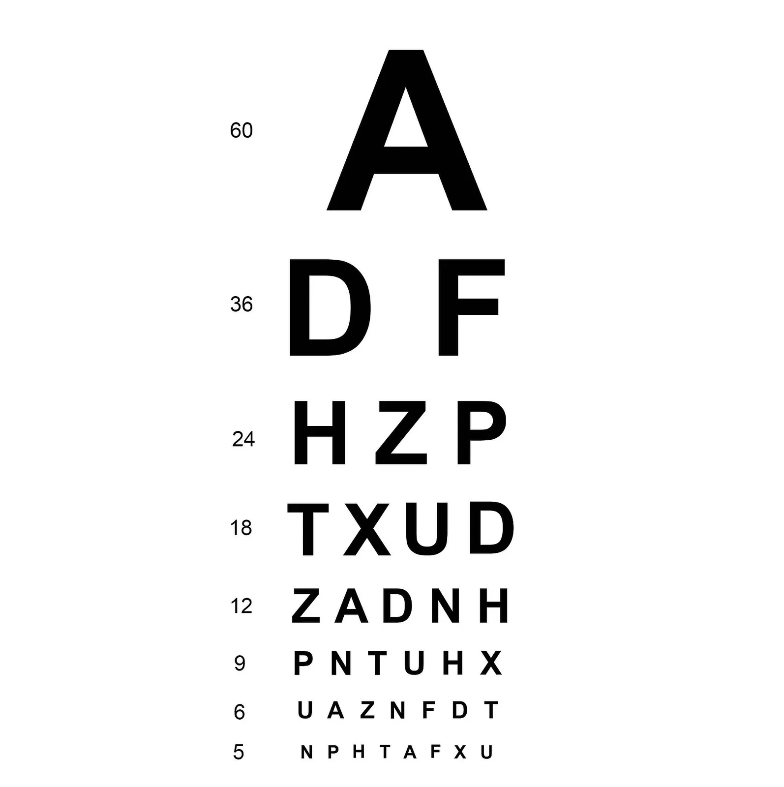
The likely mechanism is the pupil. A bright page makes the pupil smaller, which reduces optical blur and sharpens fine detail, the same way stopping down a lens increases depth of field. Mathôt and Ivanov tested this directly and found the effect is real but narrow: it shows up for very small text near the limit of acuity, not for comfortable reading sizes.
Three experiments (9, 9 and 20 observers) changed pupil size by changing the brightness around a target. Brightness did not reliably change discrimination of moderate-contrast patterns or words, but in the third experiment, with very small letters, brighter surroundings and smaller pupils improved discrimination (t = -2.356, p = .029), while larger pupils helped simple detection. The authors link this to the known positive-polarity advantage in reading. The limit: small samples, an uncalibrated monitor and no direct polarity manipulation, so treat it as a mechanism, not a dark-mode verdict.
Read the paper (free)For dark themes, my working rule:
- body text at APCA Lc -75 or beyond;
- no pure white on pure black for long reading (APCA flags Lc 90 as a maximum for large bold text);
- slightly heavier weights than in the light theme.
A colour system built in a perceptual space makes these targets far easier to hit, which is what OKLCH for design systems covers.
What about colour-blind readers in India?

Colour vision deficiency mostly affects men, and Indian school screening studies find rates between roughly 3% and 8% in boys depending on region and method. Contrast in lightness, not hue, is what keeps information readable for them, so both WCAG 2 and APCA help, as long as you never use colour alone to carry meaning.
As part of a school eye-screening programme in Kanchipuram district covering 250,052 children in 1,047 schools, 74,986 boys aged 11 to 17 were screened with Dalton plates and confirmed with Ishihara plates. Prevalence was 2.76% (95% CI 2.65-2.88), higher in urban schools (3.17%) than rural (1.79%). The limit: only boys were tested, the type of deficiency was not classified, and screening happened in bright school corridors in one district, so it is not a national figure.
Read the paper (free)At 2.76%, a product with one crore male users in that age range would have about 2.8 lakh affected readers. Practical rules that follow:
- Pair colour with a second cue. Icons, labels, patterns or position for status, errors and chart series.
- Separate series by lightness. In charts, make adjacent categories differ in lightness, not just hue. In a Stack Exchange thread about a colour wheel for colour-blind colleagues, the answers land on the same fix: let lightness and saturation, not only hue, change around the wheel.
- Avoid red-green as the only signal. The classic pass/fail, profit/loss pairing is the worst case.
What should a design system specify today?
Specify WCAG 2.2 AA as the floor for compliance, APCA Lc targets as the floor for readability, and test both on every token pair. That double target removes most of the pairs in the table above that pass on paper and fail in use.
| Token role | WCAG 2.2 floor | APCA working target |
|---|---|---|
| Body text on surface | 4.5:1 | Lc 75 minimum, Lc 90 preferred |
| Secondary text at 16 px or more | 4.5:1 | Lc 60 |
| Headings over 32 px | 3:1 | Lc 45 |
| Button text on brand fill | 4.5:1 (or 3:1 if large) | Lc 60 at 16 px or more |
| Focus rings, input borders, icons | 3:1 (SC 1.4.11) | Check visually; APCA non-text guidance is still a placeholder |
Brand colours
Brand colours are where this bites. A saturated orange or cobalt often cannot carry text in both polarities, so decide early which text colour each brand fill takes and write it into the guidelines.
I go through how to document that in the brand guidelines template. Print has its own contrast problem, because ink on paper reflects light instead of emitting it; see RGB vs CMYK. My own design range is on the Kala page.
What's new
- WCAG 3.0 Working Draft keeps the text contrast threshold as "to be determined" W3C, Sep 2026
- EN 301 549 V4.1.1 published, moving European accessibility requirements to WCAG 2.2 Davis Wright Tremaine, Sep 2026
- WebAIM Million 2026: low-contrast text back up to 83.9% of home pages WebAIM, Mar 2026
Questions people ask
How do I find the exact contrast ratio between two colours?
Convert both colours to relative luminance with the WCAG formula (linearise each channel, weight 0.2126, 0.7152 and 0.0722) and compute (lighter + 0.05) / (darker + 0.05). The calculator above does it from RGB values. On the Stack Exchange thread for this question, the accepted approach is the same: read the formula from the W3C's own contrast calculator, or use a checker app.
Why does a contrast checker say black text is better on my orange button?
Because bright orange has high relative luminance (about 0.37 for #FF8000), so WCAG 2 rates dark text higher. APCA, which models lightness contrast by polarity, rates white on orange higher, matching what many readers see. Use WCAG 2 for compliance and judge legibility with both.
Is APCA required anywhere?
Not as of November 2026. WCAG 3 has not chosen a contrast algorithm, and laws such as the European Accessibility Act point to EN 301 549, which uses WCAG 2.2.
Is 21:1 black on white the best choice for body text?
Not necessarily. It is the maximum, and some readers find it harsh on bright screens; APCA treats Lc 90 as preferred for body text, and the 2025 ICCS study found lower-contrast pairs can be rated comfortable. Near-black on off-white usually reads well and still clears both tests.
Sources
- W3C WCAG GitHub: Contrast Ratio Math and Related Visual Issues, issue 695 (Andrew Somers) (2019, open)
- W3C: Web Content Accessibility Guidelines (WCAG) 2.2 (edition of 12 Dec 2024)
- W3C WAI wiki: Relative luminance, with the 0.04045 errata note
- W3C: WCAG 3.0 Working Draft (10 Sep 2026)
- Myndex: SAPC-APCA repository (2026)
- Myndex: APCA 0.0.98G-4g base formula and constants
- Readability Tech: APCA Readability Criterion, Bronze levels
- WebAIM: The WebAIM Million, 2026 report (2026)
- Olejnik-Krugly et al.: Contrast Computation for Improved Visibility and User Experience in Educational Interfaces, ICCS (2025)
- Mathôt and Ivanov: The effect of pupil size and peripheral brightness on detection and discrimination performance, PeerJ (2019)
- Krishnamurthy et al.: Prevalence of color vision deficiency among school-going boys in South India, IJO (2021)
- Davis Wright Tremaine: European Accessibility Act ICT standards update (2026)
- Graphic Design Stack Exchange: Why is the W3C contrast score recommending hard-to-read text?
- Graphic Design Stack Exchange: How to determine exact contrast ratio
- Graphic Design Stack Exchange: A color wheel for the color-blind

Sapta (Saptarshi Sarkar) is a mechanical engineer turned marketer in Bengaluru and a solo touring rider. He writes the seven Saptaverse blogs. Work with him or read more of Artblog.