Indian truck art is a hand-painted design system that has run for about a century without a brand manual: the same zones on every truck, a shared vocabulary of motifs such as the evil-eye charm and "Horn OK Please", saturated high-contrast colour and block lettering sized to be read from a moving vehicle. For designers it is a lesson in how consistency comes from a shared grammar rather than a style guide, and in designing for distance, speed and a mass audience.
- 1.55 crore registered goods vehicles in India (MoRTH, 2022) carry this typography.
- Fixed zones: rear panel, mudflaps, crown, bumper and sides each have a job.
- "OK" in Horn OK Please has no proven origin; the kerosene and Tata stories are theories.
- 14:1 contrast for black on truck yellow, against 4.5:1 that WCAG asks for body text.
- 3D shadows are a second outline for legibility, not decoration.
- HandpaintedType (2010) turned sign painters' alphabets into fonts and shared revenue 50:50.
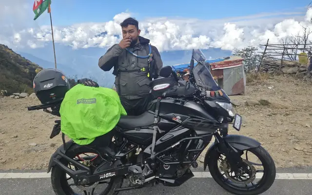
India had about 1.55 crore registered goods vehicles in 2022, by the Ministry of Road Transport and Highways' count. Anyone who rides the highways, as I do on a Pulsar NS200 and a KTM 390 Adventure, reads more truck backs in a day than billboards. That makes the back of a truck one of the most-seen pieces of typography in the country, and almost none of it is made by people who call themselves designers.
Where did Indian truck art come from?
Indian truck art grew out of the 1920s, when imported trucks reached colonial India and owners and drivers began decorating them with motifs drawn from folk painting. It became a trade of specialist painters and body builders working in transport hubs, passing styles from master to apprentice.
The trucks are decorated for reasons that are partly practical and partly personal. A truck is a driver's workplace and, for days at a time, home. Ashima Madan's 2018 study notes an All India Motor Transport Congress estimate of 75 lakh commercial vehicles at the time, with 30 to 35 lakh on the road at any moment.
Decoration does four jobs:
- it marks ownership;
- it carries prayers and protection;
- it advertises the painter and the transport company;
- it expresses the driver.
Regional styles
Regional styles are distinct. Punjab is described as a major centre; Uttar Pradesh trucks carry the most couplets and verse; Haryana, Rajasthan, Delhi and Jammu and Kashmir trucks share the layout but with fewer poems and their own iconography. Named painters include Nafees Ahmad Khan of Indore, who has painted a truck a day for over three decades, and Tilak Raj Dhir of Delhi.

What does "Horn OK Please" actually mean?
Horn OK Please asks drivers behind to sound the horn before overtaking, because many trucks lacked working side mirrors and drivers could not see a vehicle coming up alongside. The "OK" in the middle has no settled explanation.
Where the "OK" came from: three theories
| Theory | What it claims | Evidence |
|---|---|---|
| Kerosene | Second World War trucks ran on kerosene, and the sign read "Horn Please, On Kerosene" to keep others away from a flammable load | None primary; quoted as a theory |
| Tata | "OK" links to Tata, whose trucks dominated Indian roads, and the sign-off "OK Tata, bye-bye" | None primary; quoted as a theory |
| Overtaking | Coined simply to help vehicles overtake on narrow roads | A former AIMTC president's account, 2015 |
Neither of the first two theories has primary evidence behind it, and both appear in serious sources as theories only. A former All India Motor Transport Congress president offered the plainer reading in 2015.
On 1 May 2015, Maharashtra's transport commissioner, Mahesh Zagade, issued a circular telling vehicle owners to stop painting "Horn OK Please", "Blow Horn" and "OK Tata Byebye" on their rear panels. It covered every vehicle in the state, including private ones and those registered elsewhere. The department said it received daily complaints about honking in silence zones near hospitals and schools, and Zagade called the move an attempt at "cultural change": the circular claimed that motorists honk more when they read such signs. Some transporters' associations welcomed it. Bal Malkit Singh, a former president of the All India Motor Transport Congress, said the phrase had been coined so vehicles could overtake on narrow roads, and that on wider highways "there is no need to honk".
The Quint: Maharashtra govt says bye to Horn OK sign (1 May 2015)It is a rare case of a government trying to edit a piece of vernacular design.
| Zone of the truck | Typical elements | Design job |
|---|---|---|
| Rear panel | "Horn OK Please", "Use Dipper at Night", "Keep Distance", "Blow Horn", "Awaaz Do" | Instructions for traffic behind, in block Roman capitals even when the words are Hindi |
| Rear sides and mudflaps | Couplets, proverbs, the evil-eye slogan, owner and painter details | Voice, humour and protection; advertising for the painter |
| Crown above the cab | Deity images, the transport company name, ornate lettering | Identity and blessing, readable to oncoming traffic |
| Front bumper and grille | Chains, pendants, tassels, the nazar battu charm | Protection and personality; the jingle that gives "jingle truck" its name |
| Side panels | Birds, landscapes, regional symbols, contact numbers | Space for painting, often used for business details |
Why is truck art a design system?
Truck art works as a design system because every truck follows the same grammar:
- fixed zones;
- a limited set of approved phrases and motifs;
- recurring colour pairings;
- lettering conventions that painters learn by apprenticeship.
Individual trucks vary within those rules, which is exactly how a good brand system behaves.
One motif, several meanings
Madan's study, based on photographs and interviews at Delhi's Punjabi Bagh and Sanjay Gandhi transport nagars, reads these elements through semiotics and finds that they cannot be filed neatly as icon, index or symbol, because they work on several levels at once.
A painted shoe is a joke, a threat and a charm against the evil eye. The phrase "Buri nazar wale tera munh kala", roughly "may the one with the evil eye be shamed", performs the same job in words.
Some of the structure is also legal: the Central Motor Vehicle Rules, 1989, prescribe certain features on commercial vehicles, and painters know them well.
A qualitative study of truck art in Punjab, Rajasthan and Haryana using Peirce's and Saussure's semiotics. It analyses photographs and 2013 interview material gathered at Delhi transport hubs, where trucks from all four regions park, and compares the meaning of truck motifs with their reuse as a "truck art" style on designer merchandise from brands such as Chumbak. It finds that motifs carry layered meanings for drivers, and that merchandise keeps the look while stripping much of that meaning, even copying painters' spelling errors as deliberate kitsch. The limit: a master's paper with a convenience sample in one region.
Read the paper (free)This connects to a Graphic Design Stack Exchange question about how brands stayed consistent before computers. The answers describe master artwork photographed at several sizes, rooms of paste-up boards and Pantone numbers read over the phone.
Truck art solved the same problem with no masters at all. Consistency lived in painters' hands and in a vocabulary everyone on the road understood.

Why do truck art colours work?
Truck art colours work because they maximise contrast for distance and dust: saturated yellows, reds, greens and blues set against each other, and black lettering on yellow or white panels. These pairings stay readable in harsh sun, through grime and from a vehicle behind.
Contrast, measured
Contrast is measurable. The WCAG contrast ratio compares the relative luminance of two colours, and black on bright yellow scores about 14:1 (the scale tops out at 21:1 for black on white), far above the 4.5:1 that accessibility guidelines ask for in body text.
Red on yellow, a classic truck pairing, scores much lower on luminance, which is why painters outline red letters in black or white.
A Graphic Design Stack Exchange thread on why yellow and red look good together reaches a related point: the top answer credits high contrast and composition, and another notes that the "yellow" in the photo is closer to orange and the red darker, so the pair shares warmth while still contrasting.
Contrast ratio of two paint colours (WCAG formula)
Try red (200, 16, 46) on that yellow and the ratio falls to about 3.9:1, enough only for large text. That is the painter's reason for the black shadow and white outline around red letters, and it is the same logic covered in more depth in colour contrast, WCAG and APCA.
Brand palettes that are built for screens rarely get stress-tested like this. My own RoadHook palette pairs crimson, cobalt and neon lime with midnight and white, and strong contrast is what I like in it.
What makes truck lettering readable at speed?
Truck lettering is readable at speed because of three habits:
- tall, heavy block capitals with generous spacing;
- three-dimensional drop shadows that separate letters from busy backgrounds;
- short phrases that can be taken in during a glance.
The 3D shadow is not decoration; it is a second outline.
The rules match what type designers do for road signs: large x-height or all capitals, open counters, and wide letter spacing to avoid letters merging at a distance.
Painters also mix scripts on one panel, Roman capitals for the standard phrases and Devanagari, Gurmukhi or Urdu for verse, which makes truck backs a working example of bilingual layout. The typographic side of that is in bilingual Hindi and English layout and Indian script fonts ranked.
A documentary essay with photographs by a New Delhi journalist and translator with a PhD in English from JNU, focused on "truck literature": the couplets, adages and slogans painted on bumpers and tailgates. It finds love and romance are the most common theme, followed by philosophy, safe-driving advice and social comment, and that Uttar Pradesh trucks carry the most verse while Haryana, Rajasthan, Delhi, Jammu and Kashmir and Punjab trucks differ in style and carry fewer poems. A truck repairman interviewed blames cheap printing for the decline of painted verse. The limit: an essay built on field observation and interviews, not a systematic survey.
Read the essay (free)
Is hand-painted truck art dying?
Hand painting is shrinking but not gone. Cheap vinyl stickers and digital printing, which can produce a panel in minutes, have taken over much of the lettering work, and painters across the sign trade lost income as printed vinyl from desktop publishers replaced hand-painted boards.
From brush to font
The response from designers has been to turn the lettering into fonts. Hanif Kureshi's HandpaintedType, started in 2010, asked Old Delhi sign painters to design their own alphabets and digitised them as fonts named after each painter.
The first, Painter Umesh, was free for non-commercial use; paid fonts sold for about $50, and commissions through the project were split 50:50 with the painters. One painter's fee per job reportedly rose from ₹300–500 to around ₹5,000. Truck art itself has also become a commercial style, most visibly on Chumbak-style merchandise.
See the data as a table
| Fee per job (₹) | |
|---|---|
| Before (upper estimate) | 500 |
| After (reported) | 5000 |
Source: Huck magazine on HandpaintedType, Nov 2014 · A single reported case, not an industry average.
The risk in the commercial revival is the one Madan identifies: the look survives while the meaning goes. A tote bag with "Horn OK Please" in faux-3D letters borrows the surface of a system without its function.
What can brand designers learn from truck art?
Brand designers can learn three things from truck art: that a shared grammar beats a long rulebook, that distance and environment should set your contrast and type size, and that a system can allow personal expression without losing recognition.
- Define zones, not layouts. Truck art fixes where things go and lets content vary. A brand system that defines zones and roles for each format scales further than a set of templates.
- Keep the vocabulary small. A handful of phrases and motifs, used everywhere, are recognised by everyone. Most brands use too many assets, not too few.
- Design for the worst viewing condition. Test colour and type at distance, in sunlight, at speed and through dirt. If it works on a truck, it works on a phone.
- Use outlines and shadows functionally. A shadow that separates type from a busy background is a legibility tool. A shadow added for style is what dates a logo, as in why logos look dated.
- Leave room for the individual. Every truck is the same system and a different truck. Brand systems that allow local voice, within fixed rules, feel alive.
- Respect the object. Truck painters work with the panels, ribs and bumpers of the body, not over them. When graphics were made for my own KTM, what I kept asking for was that the panel's original shape stay intact and the design follow its contours. Good vernacular design has always worked that way.
The same hand-painting tradition fed India's cinema posters, covered in the history of Bollywood's hand-painted posters. For the road side of this blog's world, the Ride Atlas collects my long rides.
What's new
- How truck art in India and Pakistan grew from one tradition into two styles 91Trucks, Dec 2025
- Sahapedia's record of north Indian truck verse and its decline Sahapedia, 2021
- MoRTH data: 1.55 crore registered goods vehicles in India (2022) Dataful from MoRTH, latest release
Questions people ask
Why do Indian trucks say "Horn OK Please"?
It asks vehicles behind to honk before overtaking, since many trucks lacked usable side mirrors. The origin of "OK" is disputed; the kerosene and Tata theories are popular but unproven.
Is "Horn OK Please" banned?
Maharashtra's transport department issued a circular in 2015 banning the phrase on the rear of vehicles in the state, citing noise from honking. It applies only in Maharashtra and the phrase is still common elsewhere.
What is the nazar battu on trucks?
A protective charm against the evil eye, hung on or painted onto the truck; a painted or hanging shoe is a common form. The slogan "Buri nazar wale tera munh kala" does the same job in words.
Can I buy fonts based on Indian truck and sign lettering?
Yes. HandpaintedType sells and gives away fonts digitised from Indian sign painters' lettering, with revenue shared with the painters.
Sources
- Madan: Visual Semiotics of Truck Art in India, Trinity College Dublin (2018)
- Kafle: Ode to the Road, Truck Art of North India, Sahapedia (2021)
- Wikipedia: Truck art in South Asia, origins, motifs and named painters (accessed 2026)
- The Quint: Maharashtra govt says bye to Horn OK sign (2015)
- Huck: HandpaintedType is reinvigorating Delhi's sign-painters (2014)
- Dataful: Category-wise motor vehicles registered in India, from MoRTH Road Transport Year Books (2022 data)
- 91Trucks: Truck art in India and Pakistan (2025)
- W3C: WCAG 2.1 contrast ratio and relative luminance definitions (2018)
- Graphic Design Stack Exchange: How was brand consistency maintained before computers?
- Graphic Design Stack Exchange: Why do yellow and red look good together in this photo?

Sapta (Saptarshi Sarkar) is a mechanical engineer turned marketer in Bengaluru and a solo touring rider. He writes the seven Saptaverse blogs. Work with him or read more of Artblog.