The free Hindi fonts with the widest coverage of Indian scripts are Noto Sans and Noto Serif, Ek Type's Anek and Baloo 2, and Google Sans: each covers all nine major Indian scripts on Google Fonts. Noto Sans leads on weights too, with nine from Thin to Black plus a width axis. All ten families on this list are free for commercial use under the SIL Open Font License or Google Fonts' open licences.
- Five free families cover all nine major Indian scripts: Noto Sans, Noto Serif, Anek, Baloo 2 and Google Sans.
- 63 of 128 Indian-script families on Google Fonts support Devanagari; only 6 support Odia.
- Anek has the widest width axis here (75–125), useful for long Tamil and Malayalam headlines.
- Noto takes its name from "no more tofu", the blank boxes shown for missing glyphs.
- Always test conjuncts like क्ष, त्र, ज्ञ in the exported file, not only on screen.
The criterion is stated: the number of the nine major Indian scripts each family covers on Google Fonts (Devanagari, Bengali, Gujarati, Gurmukhi, Kannada, Malayalam, Odia, Tamil, Telugu), then the number of weights. I read the counts from Google Fonts' own family metadata on 11 November 2026. Where a "family" ships as one font per script, such as Noto Sans Devanagari and Noto Sans Tamil, I count the superfamily as one entry, because that is how designers use it: one design voice across scripts.
| Rank | Family | Indian scripts | Weights | Variable axes |
|---|---|---|---|---|
| 1 | Noto Sans (Indic) | 9 | 9 (100–900) | Weight, width |
| 2 | Noto Serif (Indic) | 9 | 9 (Odia: 4) | Weight; width on 3 scripts |
| 3 | Anek | 9 | 8 (100–800) | Weight, width |
| 4 | Baloo 2 | 9 | 5 (400–800) | Weight |
| 5 | Google Sans | 9 | 4 (400–700) | Weight, grade, optical size |
| 6 | Hind | 6 | 5 (300–700) | None |
| 7 | Tiro Indic | 6 | 1 (400) | None |
| 8 | Mukta | 4 | 7 (200–800) | None |
| 9 | Alkatra | 3 | 4 (400–700) | Weight |
| 10 | Arima | 2 | 7 (100–700) | Weight |
| Rank | Family | Designer | Style |
|---|---|---|---|
| 1 | Noto Sans (Indic) | Sans | |
| 2 | Noto Serif (Indic) | Serif | |
| 3 | Anek | Ek Type | Sans |
| 4 | Baloo 2 | Ek Type | Rounded display |
| 5 | Google Sans | Sans | |
| 6 | Hind | Indian Type Foundry | Sans |
| 7 | Tiro Indic | Tiro Typeworks, John Hudson, Fiona Ross | Serif |
| 8 | Mukta | Ek Type | Sans |
| 9 | Alkatra | Suman Bhandary | Display |
| 10 | Arima | Natanael Gama, Joana Correia, Rosalie Wagner | Display |
See the data as a table
| Families (families) | |
|---|---|
| Devanagari | 63 |
| Telugu | 27 |
| Tamil | 17 |
| Gujarati | 13 |
| Kannada | 11 |
| Bengali | 11 |
| Gurmukhi | 10 |
| Malayalam | 9 |
| Odia | 6 |
Source: Google Fonts family metadata (my count, 11 November 2026) · Counts families whose subsets include the script. Bengali-script families also serve Assamese; Devanagari serves Hindi, Marathi, Nepali, Sanskrit and more.
1. Noto Sans (Indic families)
Noto Sans covers all nine major Indian scripts with nine weights from 100 to 900 and a width axis from 62.5 to 100, making it the most complete free sans for Indian languages. Google added the current Indic families to Google Fonts in November 2020.
On 6 October 2016, two engineers on Google's internationalisation team, Xiangye Xiao and Bob Jung, announced that a project begun five years earlier was ready. Its target was "tofu", the blank rectangles a computer shows when a font has no glyph for a character. The project's name was a promise: Noto, short for "no more tofu".
Built with Monotype, Adobe and volunteer reviewers, the family by then covered more than 800 languages and over 110,000 characters, Indic scripts among them, and Google made the fonts, the design sources and the build pipeline free. For anyone setting Odia or Gurmukhi beside Hindi, that release made a free family with one design voice across scripts the default rather than a hunt.
Google Developers Blog: An open source font system for everyone (6 October 2016)Noto is Google's project to cover every script in Unicode, and it goes far beyond the big nine: Google Fonts also carries Noto families for Ol Chiki, Meetei Mayek, Tirhuta, Sharada, Takri, Modi, Kaithi, Wancho, Gunjala Gondi and many more Indian scripts.
Noto Sans Telugu ranks 17th by popularity among all 1,959 Google Fonts families, ahead of many Latin fonts. The trade-off is personality: Noto is designed to be neutral and harmonised across scripts, which is right for apps and forms and dull for a brand.
- Use for: interfaces, government and multi-state forms, any page that must show several scripts together
- Pair with: Noto Sans Latin, which shares its metrics
2. Noto Serif (Indic families)
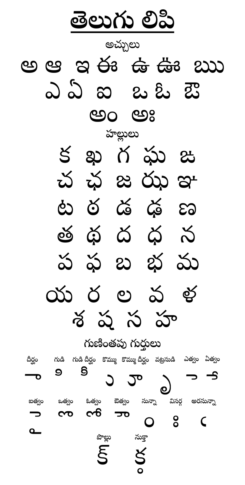
Noto Serif covers the same nine scripts with nine weights, except Noto Serif Oriya, which has four (400–700). Bengali, Devanagari and Tamil also have a width axis.
A "serif" Indian script means a high-contrast, calligraphic stroke modelled on traditional pen forms rather than the low-contrast, monoline strokes of a sans. Use it for long reading text in print, books and editorial pages, where contrast helps distinguish conjuncts.
3. Anek

Anek, from the Mumbai foundry Ek Type, covers all nine scripts with eight weights from 100 to 800 and a width axis from 75 to 125, the widest width range on this list. Google Fonts added it in February 2022.
The width axis is what makes Anek special. Indian scripts vary hugely in natural width: a Tamil or Malayalam word takes far more horizontal space than the same word in Devanagari. With Anek you can condense a long Malayalam headline to fit the same column as its Hindi version, while keeping the same weight and voice. Ek Type's own site describes Anek as covering 10 scripts, counting Latin.
- Use for: bilingual and multilingual brand systems, posters, headlines
- Answers the forum question: Anek's bold condensed widths are the closest free match to Impact or Oswald across Indian scripts
4. Baloo 2
Baloo 2, also from Ek Type, covers nine scripts with five weights (400–800) and a weight axis, and it is the 28th most popular family on Google Fonts. It ships as one font per script, each with its own name: Baloo 2 (Devanagari), Bhai (Gujarati), Bhaina (Odia), Chettan (Malayalam), Da (Bengali), Paaji (Gurmukhi), Tamma (Kannada), Tammudu (Telugu) and Thambi (Tamil).
Most of the names are words for brother in the script's main language, which says something about the family: rounded, friendly and informal. It suits children's products, food brands and social graphics; it does not suit legal text.
5. Google Sans
Google Sans, Google's own brand typeface, arrived on Google Fonts on 9 December 2025 as an open-licence family, and it covers all nine major Indian scripts in a single family with four weights (400–700). It is already the third most popular family on the service.
Google Sans ranks below Baloo 2 only because it has fewer weights. Its advantage is that one family file holds Latin, all nine Indian scripts and many more, so a website does not have to juggle font names per script. Its limit is familiarity: it is the face of Google's products, so a brand that uses it will look like Google.
6. Hind
Hind, from Indian Type Foundry, covers six scripts with five weights (300–700): Hind (Devanagari), Hind Siliguri (Bengali), Hind Vadodara (Gujarati), Hind Mysuru (Kannada), Hind Madurai (Tamil) and Hind Guntur (Telugu). The Devanagari version, added in June 2014, is the 18th most popular family on Google Fonts.
Hind was one of the first good free Devanagari text faces, and its Latin is a solid neutral sans. It lacks Gurmukhi, Malayalam and Odia, and it has no variable axes, which costs it on this ranking but not on quality.
7. Tiro Indic
Tiro's Indic families cover six scripts (Bangla, Devanagari in Hindi, Marathi and Sanskrit versions, Gurmukhi, Kannada, Tamil and Telugu), but each has only one weight, 400. They were added to Google Fonts in May 2022.
They are designed by Tiro Typeworks with the type historian Fiona Ross and John Hudson, who also worked on Adobe Devanagari, and they are the most bookish faces here: traditional proportions, careful conjuncts, and separate Hindi, Marathi and Sanskrit versions of Devanagari to respect each language's preferred letterforms. Use them for text, not headlines.

8. Mukta
Mukta, from Ek Type, covers four scripts with seven weights (200–800): Mukta (Devanagari), Mukta Mahee (Gurmukhi), Mukta Malar (Tamil) and Mukta Vaani (Gujarati). It is the 29th most popular family on Google Fonts.
Mukta is a clean humanist sans with open counters, a good default for Hindi body text on screens. The Ek Mukta design was one of the Devanagari typefaces in a 2026 study of how readers judge letter similarity, covered below.
9. Alkatra
Alkatra, by Suman Bhandary, is unusual: one font file that holds Bengali, Devanagari and Odia (plus Latin), with four weights (400–700). It is a lively display face for headlines and packaging rather than text.
10. Arima
Arima covers Malayalam and Tamil with seven weights (100–700) on a weight axis. It is a display face with a calligraphic swing, useful for South Indian brands that want something warmer than Noto.
Just outside the ten are dozens of strong single-script families: Poppins (Devanagari, 9 weights, the 6th most popular family on Google Fonts), Kalam (handwriting), Rozha One and Teko from Indian Type Foundry, Catamaran for Tamil, and Manjari and Gayathri for Malayalam from Swathanthra Malayalam Computing. For how Devanagari type is built, see how Devanagari fonts work.
What should you check before using a free Indian font?
Check four things: conjunct coverage, matching Latin, licence and rendering. A free font that cannot form the conjuncts your language needs will break your text silently.
- Conjuncts. Type a test string with the hard cases for your language, such as क्ष, त्र, ज्ञ, श्र and ह्म in Hindi, or long Tamil and Malayalam ligatures. Look for dotted circles or broken half-forms.
- Latin pairing. In bilingual work, the Latin and Indian scripts must share weight and size. Families like Noto, Anek, Hind and Mukta include matching Latin; for layout advice see bilingual Hindi and English layout.
- Licence. All families here are free for commercial use. The SIL Open Font License (version 1.1, 2007) allows use in print, logos, websites and apps, and allows modification, but modified versions may need a new name if the font declares a Reserved Font Name.
- Rendering. Indian scripts depend on OpenType shaping. Test in the actual target: a browser, InDesign with the World-Ready Composer, or a print RIP. Adjust line height generously, because matras above and below the line need room, and see kerning, tracking and leading.
The W3C's reference for how Indic text should behave on the web and in digital publishing, edited by India's Department of Electronics and IT. It defines the Indic orthographic syllable formally, and says text tools should treat that syllable, not the single character, as the unit for cursor movement, line breaking, letter spacing, vertical text and drop caps. Letter spacing must be inserted after each syllable, so a conjunct is never pulled apart. It also covers how the danda (।) behaves at line ends and how conjunct sorting differs between Hindi and Marathi or Nepali. The limit: it focuses on Devanagari, and the latest draft dates from May 2020.
Read the draft (free)A type designer at the University of Reading asked 1,721 people to pick the odd one out in triplets of characters, giving 96,376 responses across Cyrillic, Devanagari and Latin. The Devanagari typefaces included Adobe Devanagari, Ek Mukta, ITF Devanagari, Kohinoor Devanagari, Lohit Devanagari, Murty Hindi, Nirmala UI and Devanagari MT. Typeface design measurably changed which characters looked alike, and pairwise similarity data did a poor job of predicting the contextual judgements. Designers and non-designers judged differently, and for Devanagari, reading fluency mattered more than nativity. Why it matters: the font you choose changes which letters readers may confuse. The limit: it measures perceived similarity, not reading speed.
Read the paper (free)Can you use Google Fonts for print work?
Yes. Google Fonts' families are open-licensed for print, including commercial print, and you can download the font files and install them locally. Use the static or variable TTF files from the family page, embed them in the PDF, and check conjuncts in the exported PDF, not only on screen.
One practical note for Indian print: variable fonts are still handled unevenly by some older print workflows, so for a press job it is safer to export the specific static weights you used. If a printer's system substitutes a font, Devanagari usually breaks first and most visibly.
What's new
- Google Sans, covering nine Indian scripts, arrives on Google Fonts as an open-licence family Google Fonts, Dec 2025
- Kripa, a Devanagari family by Kedar Gadge with a 100–900 weight axis, is added to Google Fonts Google Fonts, Sep 2026
- Playpen Sans Deva, a handwriting-style Devanagari by TypeTogether with Pooja Saxena and Gunjan Panchal, joins Google Fonts Google Fonts, May 2025
- Study of 1,721 readers shows typeface design changes which Devanagari letters look alike Visual Cognition, Feb 2026
Questions people ask
What is the best free Hindi font?
For body text on screens, Mukta, Hind and Noto Sans Devanagari are the safest choices. For a brand that needs other Indian scripts too, Anek is the most flexible because of its width axis.
Is there a Hindi font like Impact or Oswald?
Anek Devanagari in its bold, condensed widths is the closest free match. Teko and Khand from Indian Type Foundry are also narrow and heavy, but Devanagari only.
Are Google Fonts free for commercial use in India?
Yes. They are released under open licences, mostly the SIL Open Font License, which allows commercial use in print, logos, websites and apps.
Which free font supports the most Indian languages?
Noto, which covers all nine major scripts plus many minority scripts such as Ol Chiki, Meetei Mayek and Wancho through separate Noto families.
For the language data behind these scripts, see India's most spoken languages by census.
Sources
- Google Fonts: family metadata, subsets, weights, axes and popularity (read 11 November 2026; source for all counts)
- Ek Type: foundry catalogue (Anek, Baloo 2, Mukta) (2026)
- SIL International: Open Font License 1.1 (2007)
- W3C: Indic Layout Requirements, Working Draft (2020)
- Březina: contextual similarity of characters in Cyrillic, Devanagari and Latin, Visual Cognition (2026)
- Google Fonts: Google Sans specimen (2025)
- Google Fonts: Noto project (2026)
- Google Developers Blog: An open source font system for everyone (2016; the Noto launch, "no more tofu", 800 languages and 110,000 characters)

Sapta (Saptarshi Sarkar) is a mechanical engineer turned marketer in Bengaluru and a solo touring rider. He writes the seven Saptaverse blogs. Work with him or read more of Artblog.