A good logo design process runs in ten steps: a written brief, research on the category, word lists, 50 or more thumbnail sketches, vector construction on a simple grid, optical corrections, size tests from 16 pixels to a hoarding, colour and one-colour versions, clear-space and minimum-size rules, and a trademark search and file pack. Most weak logos fail at step 1 (no brief) or step 7 (never tested small), not at the drawing stage.
- 10 steps in three phases: define, design, deliver.
- Draw 50+ thumbnails by hand before you open any software.
- The mark must still read at 16 × 16 px, the size of a browser tab icon.
- Descriptive logos help unknown brands: only 41% of 597 brands studied used one (Luffarelli et al., 2019).
- Filing a trade mark in India costs ₹4,500 per class for individuals, startups and small enterprises.
- The Nike Swoosh cost $35; the founder didn't love it at first.
I have freelanced since about 2013, across graphic and brand identity work among other things, and my formal training is a BE in mechanical engineering plus a car-design workshop through Launchpad, so this is a working process rather than a syllabus. It assumes you are designing for a small Indian business or a startup, where the logo will appear on a phone screen, a WhatsApp display picture, a shop board, a delivery bag and an invoice, often printed by a local press. Every step below ends in something you can show the client.
What goes into a logo design brief?
In 1971 Phil Knight's young shoe company in Oregon needed a mark for its own footwear. He asked Carolyn Davidson, a design student at Portland State University, to draw one. She mocked up five options on tissue paper and held them against the shoes so the founders could judge them in place. They picked the curved stripe, and Knight told her he didn't love it but that it might grow on him. She billed $35.
The Swoosh first appeared commercially on 18 June 1971. In 1983 Nike's president, Bob Woodell, invited her to lunch, where staff gave her a gold Swoosh ring set with a diamond and a parcel of Nike shares. The lesson for this guide: she tested on the real object, and the client's lukewarm first reaction did not decide the logo's fate.
ESPN: How college student Carolyn Davidson created the Nike Swoosh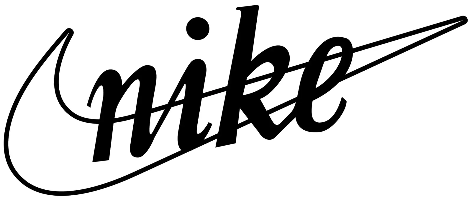
A logo brief is one page that says who the brand serves, what it must signal, where the logo will appear and what it must avoid. Write it with the client before drawing anything; it is also your defence later when taste starts to drive feedback.
- Write the brief. One line each: the business, the customer, three words the brand should feel like, three it must not, the competitors, every place the logo will appear (app icon, signboard, packaging, uniforms, vehicles), languages and scripts (English only, or Hindi, Bengali, Tamil as well), and the budget for printing. Get it signed off.
- Research the category. Collect the logos of the ten to twenty nearest competitors and pin them on one sheet. Note the shared colours, shapes and type styles. If every competitor is a blue sans-serif, that is the trap to avoid, as my count of India's top brand colours shows for banks and IT firms.
- Make word lists. List nouns, verbs and images linked to the business: what it makes, how, for whom, its place and its history. Circle the five that are both true and unusual. These are your raw material for sketches.
Should a logo describe what the business does?
For a new, unknown brand, usually yes: research finds that logos showing what a brand sells are easier to process and feel more authentic, and the advantage fades as people get to know the brand. That makes descriptiveness a sound default for small Indian businesses, where most customers meet the brand for the first time on a signboard or a search result.
Six studies, including online experiments, a set of 174 startup logos rated by 1,327 people, and a sales analysis of 423 listed brands using Compustat data, tested logos whose text or images show the type of product (a coffee bean for a coffee chain) against logos that don't. More descriptive logos raised impressions of authenticity, purchase intentions and, in the company data, sales, because they are easier to process. The benefit was much weaker for familiar brands and reversed for categories with negative associations. Across 597 brands studied, only 41% of logos were descriptive. Limit: the field data are mostly US brands from 2013, and the authors flag some effects as significant only at the 90% level.
Read the paper (free accepted manuscript)How many logo sketches should you make?
Make at least 50 small thumbnails before opening any software, in pencil or pen, each no bigger than a postage stamp. Small drawings force simple ideas; anything that only works large will die at favicon size anyway. Fill pages fast, then circle the eight to ten that still read when you squint.
- Thumbnail fast. Fifty to a hundred sketches, 2–3 cm each, in five to ten minutes per page. Mix approaches: lettermarks, symbols from the word list, combinations, wordmarks in different type styles.
- Build in vector on a grid. Redraw the best three to five as vectors using a simple construction grid: circles and squares from a few sizes, consistent stroke weights, angles from a small set (0°, 45°, 90°). A grid gives consistency, not beauty; the golden ratio is optional, and the evidence for it is weaker than its fans claim, as I explain in the golden ratio myth.
- Make optical corrections. Geometric shapes look wrong when drawn mathematically equal. Circles and points must overshoot the baseline and cap line slightly to look the same height as squares; horizontal strokes are drawn thinner than vertical ones to look equal; the visual centre of a shape sits a little above its geometric centre.
Round or angular?
Shape choices carry meaning before anyone reads a word. In one experiment the same running shoe was rated more comfortable with a round logo and more durable with an angular one, so pick the geometry to match the promise in your brief.
| Logo shape (Jiang et al., 2016) | Comfort score (of 9) | Durability score (of 9) |
|---|---|---|
| Circular | 6.50 | 5.39 |
| Angular | 5.35 | 6.27 |
Five experiments showed that logo shape alone shifts judgements of a product. In the first, 109 students saw one shoe ad with a circular, angular or no logo: comfort scored 6.50 with the circular logo against 5.35 with the angular, and durability 6.27 with the angular against 5.39 with the circular, on 9-point scales. The effect runs through mental imagery: it disappeared when people's visual working memory was occupied or when the headline stressed a different attribute. Limit: lab studies with fictional brands, so real brand history may overpower the shape cue.
Read the paper (free)How small should a logo still work?
A logo should still be recognisable at 16 × 16 pixels, the size of a browser tab icon, and on a hoarding seen from across the road. Test both before you show the client anything, because a mark that looks fine on a laptop at 300 pixels can fall apart everywhere else.
- Run the size tests. Export the mark at 16, 32 and 64 px and look at it at 100% zoom. Print it 1 cm wide on plain paper. Mock it on a photo of a shop board, a delivery bag and a phone home screen. Thin strokes, small counters (the holes in letters like "e") and fine gaps are what fail first.
- Thin strokes that drop below 1 pixel and blur;
- Small counters, the holes in letters like "e" and "a", which fill in;
- Fine gaps between parts of a symbol, which close up.
Use this to check what you just read. Enter your logo's width and its thinnest stroke in the same design units (for example, a 1,000-unit-wide artboard with a 20-unit stroke) and the width you'll display it at. The tool tells you how thick that stroke becomes on screen and how much clear space to leave.
Will your thinnest stroke survive at small size?

How much clear space should a logo have?
Set clear space as a multiple of a part of the logo itself, usually the height of one letter or the symbol's width, so the rule scales with the logo. There is no universal number, which is why the question keeps coming up on Graphic Design Stack Exchange, but a self-referencing unit avoids arguments and works at every size.
- Make colour and one-colour versions. Produce full colour, one colour (black), reversed (white on dark) and, if the business prints a lot, a Pantone spot version. If the logo needs colour to be understood, it isn't finished; a black photocopy should still work.
- Fix clear space and minimum size. Define clear space as, say, the height of the "x" on all sides; define a minimum print width in millimetres and a minimum screen width in pixels from your size tests. Write both down in the guidelines.
| Version | Use | Format |
|---|---|---|
| Full-colour primary | Website, app, signboard | SVG, PNG at 1x/2x/3x |
| One colour (black) | Invoices, rubber stamps, newspaper ads and photocopies | SVG, PDF |
| Reversed (white) | Dark backgrounds, photos, uniforms | SVG, PNG with transparency |
| Small-size symbol | Favicon, app icon, WhatsApp display picture | SVG, ICO, PNG 512 px |
| Print master | Offset and screen printing | PDF or EPS with CMYK and spot values |
How do you check that a logo isn't already trademarked in India?
Search the IP India public trade mark search for word marks and, for symbols, the Vienna code classification of figurative elements, in the Nice classes your business will use. As of November 2026 the public search asks you to log in with a one-time password sent to an email address or mobile number, and it now offers an AI-based search alongside the classic ones.
- Search, then file. Search the brand name and any distinctive word in the logo, including phonetic variants; search the device by its Vienna code. Pick the classes that cover your goods and services from the Nice Classification, whose 13th edition applies to applications from 1 January 2026. File form TM-A online: the fee under the Trade Marks Rules 2017 is ₹4,500 per class for individuals, startups and small enterprises and ₹9,000 per class for others. A registration lasts ten years and can be renewed. This is general information, not legal advice; for anything contested, use a trade mark attorney.
What files should a logo handover include?
Hand over vector masters (SVG and PDF), raster exports at fixed sizes, the colour values and a short usage sheet. SVG is the web's standard vector format, an XML language for two-dimensional graphics, and it keeps the mark sharp at any size; the difference from raster files matters most at print time, as I explain in vector vs raster for logos.
- Vector: SVG (web), PDF (print), EPS only if a printer asks.
- Raster: PNG at 512, 1024 and 2048 px wide with transparency; a 512 px square symbol for app stores and social profiles.
- Colour values: HEX and RGB for screens, CMYK for offset, Pantone if specified.
- Fonts: the name and licence of any typeface used, and the logo converted to outlines so it renders without the font.
- One-page rules: clear space, minimum sizes, the don'ts. A full system belongs in brand guidelines.

What if the client doesn't like any logo concept?
Go back to the brief, not the drawing board. Ask which brief requirements each concept misses, because "I don't like it" usually means the brief was incomplete or the client's real constraint was never written down.
"I don't like it" is almost always a brief problem, not a drawing problem.
- Show three concepts, not ten.
- Present each on real mock-ups, with the brief line it answers.
- Agree revision rounds in the contract, before the first presentation.
Remember that even Knight's first reaction to the Swoosh was lukewarm. If you are building a practice without a design degree, I wrote about that path in becoming a self-taught graphic designer in India, and you can see how I work with clients on the hire page.
What's new
- The 13th edition of the Nice Classification applies to trade mark applications from 1 January 2026 WIPO, 2025
- SVG 2 published as a W3C Candidate Recommendation Snapshot, heading for Recommendation from December 2026 W3C, Oct 2026
- IP India's public trade mark search adds OTP login and an AI-based search option IP India, Nov 2026
Questions people ask
How long does it take to design a logo?
For a small business, the ten steps usually take two to four weeks of calendar time, mostly waiting for feedback; the drawing itself is a few days. A trade mark registration in India takes much longer than the design.
Should I use the golden ratio in a logo?
Only if it helps you be consistent. Any simple set of proportions does the same job, and the evidence that viewers prefer golden-ratio proportions is weak. Consistent stroke weights and optical corrections matter more.
Can I trademark a logo that uses a free font?
Usually the logo as a whole can be registered if it is distinctive, but check the font's licence for logo use and avoid marks that are just a common word in a common typeface, which are hard to protect.
What size should a logo file be?
The master should be vector (SVG or PDF), which has no fixed size. Supply PNG exports at 512, 1024 and 2048 px wide for places that can't take vectors.
Sources
- Journal of Marketing Research: Luffarelli, Mukesh and Mahmood, Let the logo do the talking (accepted manuscript) (2019)
- Journal of Consumer Research: Jiang et al., circular and angular logo shapes (author version) (2016)
- IP India: Trade Mark Public Search (checked Nov 2026)
- ESPN: How college student Carolyn Davidson created the Nike Swoosh (the Swoosh story)
- Intepat: Trademark registration cost in India, First Schedule of the Trade Marks Rules 2017, source for the ₹4,500 and ₹9,000 fees
- WIPO: Thirteenth edition of the Nice Classification (2025)
- W3C: Scalable Vector Graphics (SVG) 2 (2026)
- Graphic Design Stack Exchange: What if the client doesn't like any concept?
- Graphic Design Stack Exchange: Whitespace around a logo
- Graphic Design Stack Exchange: Golden ratio in logo design

Sapta (Saptarshi Sarkar) is a mechanical engineer turned marketer in Bengaluru and a solo touring rider. He writes the seven Saptaverse blogs. Work with him or read more of Artblog.