KalaकलाMobile photography tips: why your phone shots come out flat
Kala means art. This is The Studio: design, photography and how I see.
For people who shoot on phones and want better pictures: my portfolio, then the settings, light, composition, colour and editing that make the difference.
You see something beautiful, lift your phone, and the picture comes out flat. The light was there. The moment was there. What went missing was the seeing, and a few settings. Most of the frames on this page came off a phone. Everything below is organised by the job in front of you: set up the camera, read the light, place the subject, fix the colour, edit, check.
Before you take photo advice from anyone, look at their pictures and their record. Mine: a mechanical engineer with no design degree, self-taught in graphic and brand design since 2013, shooting my own rides from Sikkim to the Kerala tea hills. The long version is a story in Field notes.
Roads and what was on the table. I don't know the shutter speeds, so the captions say what I saw instead. Click any frame to open it big. Use the arrow keys inside.
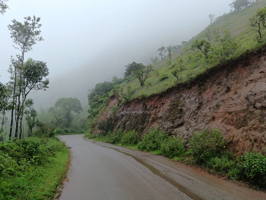
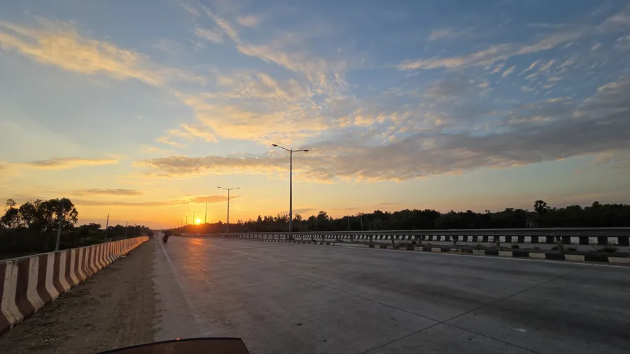
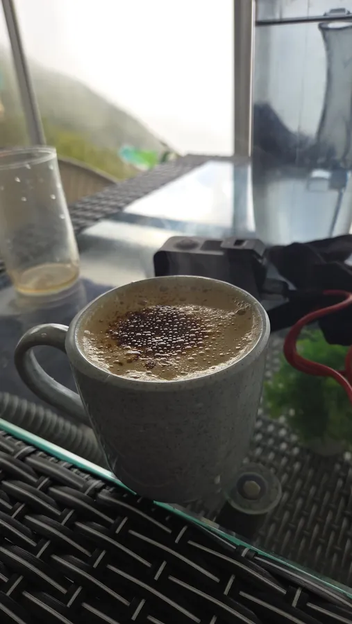
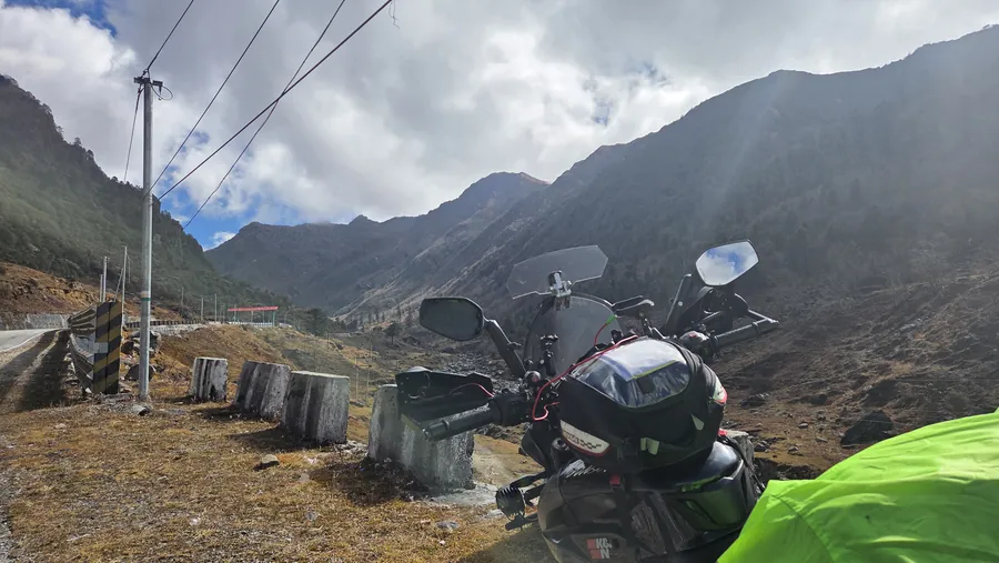
Frame 01 · Forest road · VerticalFrame 02 · Sikkim · Snow lightFrame 03 · Sikkim, high pass road · Nov 2025Frame 04 · Paddy country · Flat lightFrame 05 · Open Door Coffee Co. · CloseFrame 06 · Andhra Pradesh · Nov 2025Frame 07 · Sikkim, Nathang area · Nov 2025Frame 08 · South United · Top downFrame 09 · Sikkim · Nov 2025Frame 10 · Munnar · Nov 2024Frame 11 · Open Door Coffee Co. · WiderFrame 12 · Sikkim · Nov 2025Frame 13 · Sikkim · Nov 2025Frame 14 · Sikkim · Nov 2025
My portfolio by series: frames from the road.
Everything below is mine, shot on phones and a small camera between 2022 and 2025. Sikkim, the high passes, tea country in the south, coffee country in Karnataka, the Andhra coast. Grouped the way I remember them. Tap any frame to see it big.
Sikkim and the high passes: snow, yaks and a lake at the top.
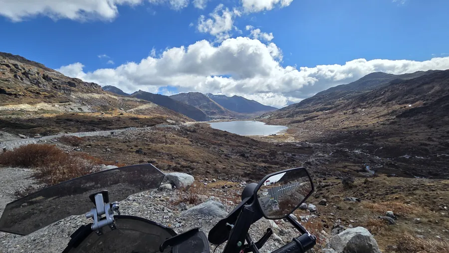
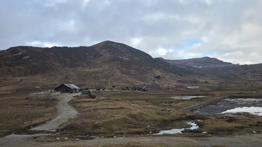
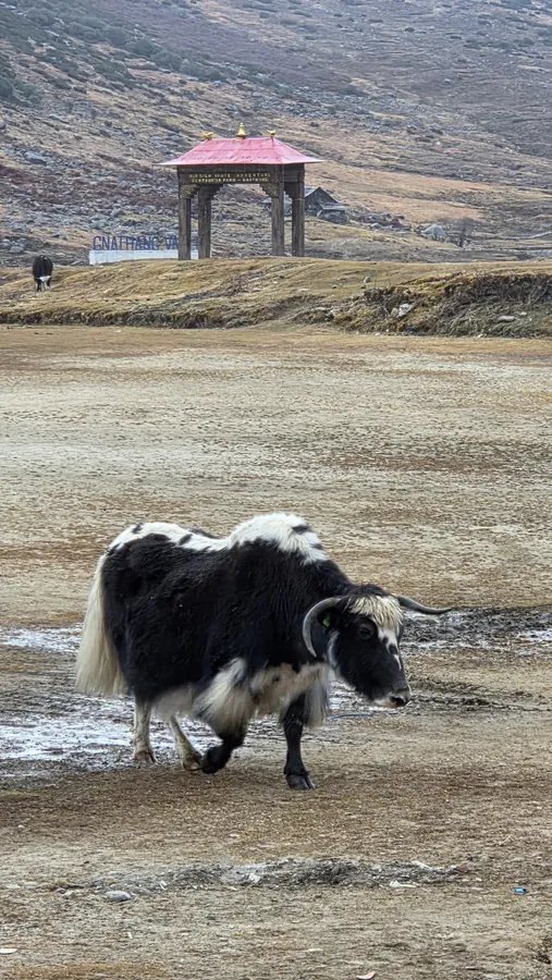
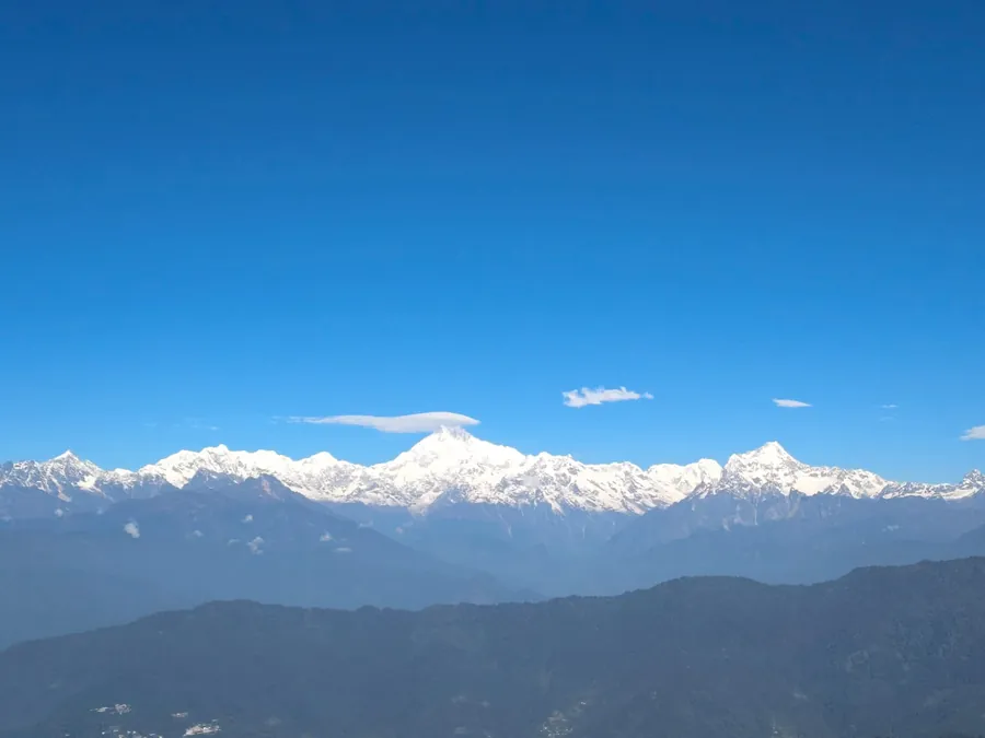
In November 2025 I rode the NS200 from Bengaluru to Sikkim and back. Up high the colours drop out: brown slopes, grey cloud, then a sky that is almost too blue. Kanchenjunga came out clear one morning.
Sikkim · Nov 2025
Sikkim, high pass road · Nov 2025Sikkim, Nathang Valley · Nov 2025
Sikkim, Nathang Valley · Nov 2025Sikkim · Nov 2025Sikkim, Nathang area · Nov 2025
Sikkim, Nathang Valley · Nov 2025Sikkim, high pass road · Nov 2025
Sikkim, high pass road · Nov 2025
Why it works: the mirror and bar sit at the bottom, the lake is a small bright shape in the middle, and two thirds of the frame is sky. I wanted the scale of that place, so I gave most of the picture to the clouds.
Sunrise and blue hour: the light I get up for.
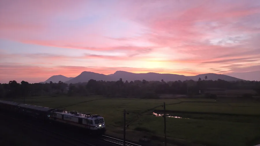
Most of my best frames happen before seven in the morning or after six in the evening. On a ride that means stopping when the sky does something, not when the plan says so.
Andhra Pradesh · Nov 2025
Munnar and Kodaikanal ride · Nov 2024Karnataka, evening ride · Jan 2025
Karnataka, evening ride · Jan 2025Andhra Pradesh · Nov 2025Tamil Nadu · Nov 2024
Karnataka, evening ride · Jan 2025
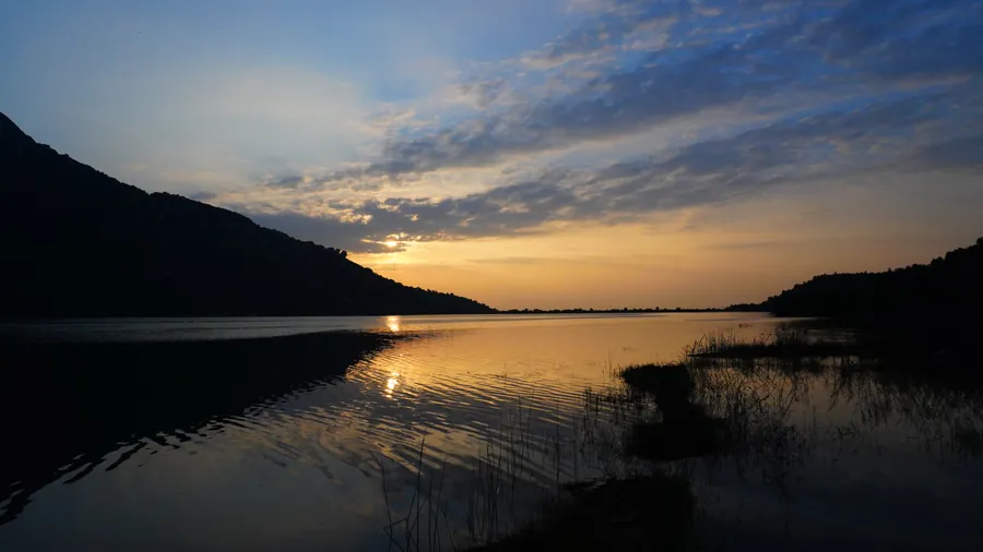
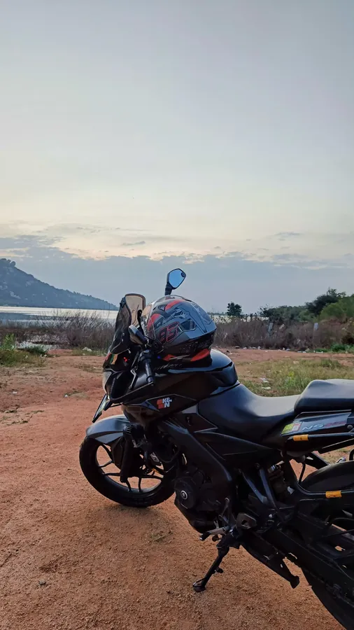
Why it works: the dark hill and the dark bank close the frame on both sides, so the eye goes straight to the gold strip of water. A January evening ride in Karnataka.
Munnar and Kodaikanal ride · Nov 2024
Why it works: the rays are doing all the work. I kept the ridge as a black line at the bottom and let the warm-to-blue gradient fill the rest. November, on the Munnar and Kodaikanal ride.
Munnar and Kodaikanal: tea country in green.
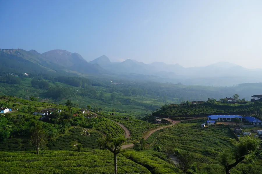
November 2024, on the NS200. Munnar is one colour in a hundred shades. I tried to shoot the pattern of the tea rows rather than the postcard view.
Munnar · Nov 2024
Munnar · Nov 2024Munnar · Nov 2024
Munnar and Kodaikanal ride · Nov 2024Munnar and Kodaikanal ride · Nov 2024Munnar and Kodaikanal ride · Nov 2024
Munnar · Nov 2024
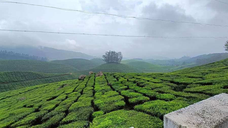
Why it works: the rows of bushes run away from me like lanes and stop at one clump of trees on the hill. That clump is the subject. Overcast light kept the greens even.
Roads and the view over the handlebar.
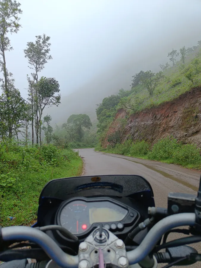
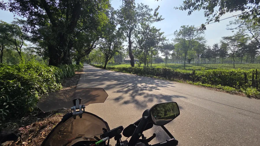
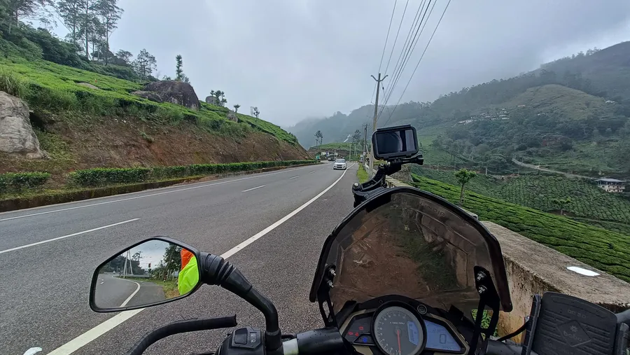
Half my photos have a windscreen or a mirror in them. That is honest: it is where I sit. The road ahead is the one leading line I never have to look for.
North Bengal tea country · Nov 2025
Sikkim · Nov 2025Karnataka, coffee country · Sep 2022
Munnar · Nov 2024Munnar · Nov 2024Sikkim · Nov 2025
Karnataka, coffee country · Sep 2022Karnataka · Sep 2022
Munnar
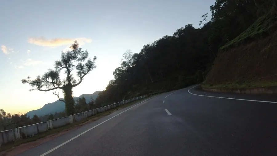
Why it works: the white edge line curves right and pulls you round the bend, while the one tree on the left holds the other side. Blue hour turns everything cool except a single warm cloud.
The machine: my NS200 in the details.
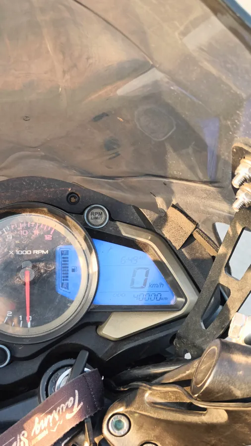
The NS200 has carried me since 2017. I shoot it where it stops: wet tarmac, red earth, and the dash at a round number.
Karnataka, evening ride · Jan 2025Munnar · Nov 2024Munnar and Kodaikanal ride · Nov 2024
Munnar and Kodaikanal ride · Nov 2024
Why it works: the odometer says 40000 km and the speed says 0.
The India in between: highways, towers and cats.
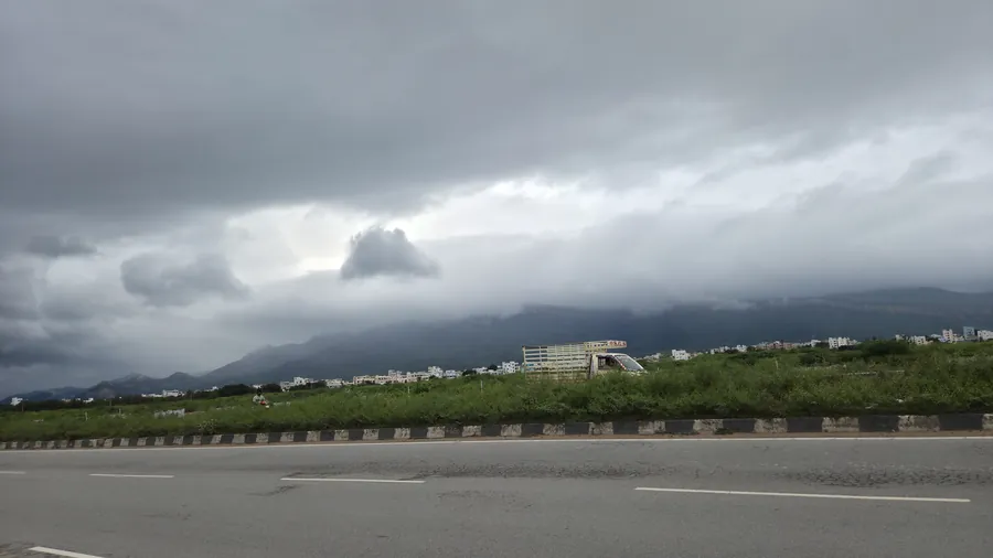
The stretches between the famous places. Concrete dividers, monsoon cloud, a phone tower in the palms, a cat on a wall.
North Bengal · Nov 2025Munnar and Kodaikanal ride · Nov 2024Sikkim, Nathang area · Nov 2025
Food and cafés: what was on the table.
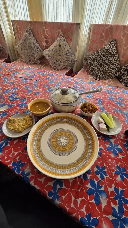
Every ride has a menu. Momos at a terrace in Sikkim, black tea in a dragon mug at the top, garlic bread and cheesecake in Chikmagalur. Get close, shoot fast, then eat.
Sikkim · Nov 2025Sikkim · Nov 2025
Sikkim, Nathang area · Nov 2025Sikkim · Nov 2025Sikkim · Nov 2025
Why it works: the plate and glass sit sharp on the wall while the tea estate goes soft behind. Food in front, place behind, so one frame tells you both what and where.
The whole roll: every frame on one wall.
All 59 photographs on this page, in one masonry wall. Tap any of them to step through the full set.
Sikkim · Nov 2025Sikkim, high pass road · Nov 2025Sikkim, high pass road · Nov 2025Sikkim, high pass road · Nov 2025Sikkim, Nathang area · Nov 2025Sikkim, Nathang Valley · Nov 2025Sikkim, Nathang Valley · Nov 2025Sikkim, Nathang Valley · Nov 2025Sikkim · Nov 2025Sikkim · Nov 2025Sikkim · Nov 2025Sikkim · Nov 2025Sikkim · Nov 2025Sikkim · Nov 2025Sikkim · Nov 2025Andhra Pradesh · Nov 2025Andhra Pradesh · Nov 2025Andhra Pradesh · Nov 2025Munnar and Kodaikanal ride · Nov 2024Munnar and Kodaikanal ride · Nov 2024Munnar and Kodaikanal ride · Nov 2024Kodaikanal · Nov 2024Tamil Nadu · Nov 2024Karnataka, evening ride · Jan 2025Karnataka, evening ride · Jan 2025Karnataka, evening ride · Jan 2025MunnarKarnataka, evening rideMunnar · Nov 2024Munnar · Nov 2024Munnar · Nov 2024Munnar and Kodaikanal ride · Nov 2024Munnar and Kodaikanal ride · Nov 2024North Bengal tea country · Nov 2025Munnar · Nov 2024Munnar · Nov 2024Karnataka, coffee country · Sep 2022Karnataka, coffee country · Sep 2022Karnataka · Sep 2022Karnataka · Sep 2022Andhra Pradesh · Nov 2025Munnar and Kodaikanal ride · Nov 2024Karnataka, evening ride · Jan 2025Munnar · Nov 2024Karnataka · Sep 2022North Bengal · Nov 2025Munnar and Kodaikanal ride · Nov 2024Sikkim, Nathang area · Nov 2025Sikkim · Nov 2025Sikkim · Nov 2025Sikkim, Nathang area · Nov 2025Sikkim · Nov 2025Sikkim · Nov 2025Sikkim · Nov 2025Chikmagalur · Sep 2022Chikmagalur · Sep 2022Chikmagalur · Sep 2022Munnar · Nov 2024Munnar and Kodaikanal ride · Nov 2024
Diagram: the seven stops of a phone shot. Each circle links to its lesson.
Phone camera settings: what to change before you shoot.
Every phone hides these in slightly different places, but they all have them. Set the first three once and leave them on. Tap a card to mark it done on your phone.
Expose for the bright part. The water and sky keep their gold; the hill is allowed to go dark.Tap to focus, get close. One small subject, sharp, and everything behind it soft.Low light, main lens. Blue hour on a hill road: hold still, let the phone gather light.
Diagram: the exposure triangle. Hover a card for what your phone does with each one.
The exposure triangle, the phone version
Three things decide how bright a picture is, and each one charges a price. On a phone you mostly steer them by tapping and sliding exposure; the phone picks the numbers.
Shutter speedHow long the sensor collects light.
Night mode and long exposures slow it down. Brace the phone on something, or you get blur. Light lesson
ISOHow much the signal is amplified.
In dim light the phone raises it and you see grain. More light, or the main 1× lens, keeps it low. Settings above
ApertureHow wide the lens opens.
Fixed on most phone lenses, so you can't turn it. Portrait mode fakes the shallow focus in software. Editing lesson
Light: golden hour, blue hour and what to do at noon.
Golden hour is when the sun sits low. Its light crosses more atmosphere, more of the blue gets scattered away on the trip, and what reaches you is warm, soft and sideways. Shadows go long. Faces glow.
Read the detail
Blue hour comes when the sun has just gone below the horizon. No direct light at all, only the sky, which turns a deep even blue. Streetlights and headlamps start to matter.
Golden hour
Closer to the equator the sun drops more steeply, so both windows are shorter in Bengaluru than in, say, Scotland. Be early.
Low side light shows texture. Rows, ridges and bark come alive when light crosses them.Overcast is a giant softbox. No harsh shadows; colours like red earth get richer.Shoot into the sun for shape. Expose for the sky and the road becomes a silhouette.Window light for food. Sit beside the window, turn the flash off, and let the daylight fall from the side.
Stuck at noon? Hard overhead sun gives dark eye sockets and flat landscapes. Find open shade for people, shoot details instead of views, or wait for cloud.
Where the light comes from, and what it does
Walk around your subject before you shoot. The same bike, face or plate changes completely depending on where the sun sits. Click a direction in the diagram to see one of my frames lit that way.
Front light: flat and bright. Colours true, no depth. Safe, rarely exciting.
Side light: texture and shape. The best default for landscapes, rows and faces.
Back light: silhouettes, glowing edges, flare. Expose for the sky.
Overcast: one huge soft source. No harsh shadows, rich colour.
Diagram: light direction seen from above, you at the bottom. Click a light to open an example.
Composition: the rule of thirds.
Split the frame into three, both ways. Put the horizon on a line, not through the middle, and the subject near a crossing. The centre is calm and static. A third is where things start to feel alive.
Check the horizon first. Then the brightest thing. Then the bike.
Roads, rails, fences, a river bank, the edge of a stair. Your eye rides them like a rider rides a road. Drag across the photo to trace two or more lines you notice. Where they meet is where the picture is quietly pointing.
Trace a line.
Composition: negative space.
The empty part of a frame is not wasted. It gives the subject air, and it tells the viewer where not to look. Shrink it and the picture gets lonely and big. Fill the frame and it gets loud. Drag it around, change the size and the wall colour.
Empty: about 80%
Measured from the print's real pixels.
Composition in my own frames: five rules, five photos.
The same rules, each in one of my frames where it does the teaching. Hover for why it works; click to open it big.
Karnataka, evening ride · Jan 2025
Thirds
The egret sits on the lower right third, the sun on the upper left. Two points, opposite corners, and the frame balances.
Sikkim · Nov 2025
Leading lines
The road edge and the trunks all point to the same spot where the road turns. You cannot look anywhere else.
Sikkim · Nov 2025
Negative space
Two thirds plain blue. The empty sky is what makes the range feel huge.
Munnar and Kodaikanal ride · Nov 2024
Light
Light itself is the subject here. The hills are just a black edge for it to come from.
Sikkim · Nov 2025
Colour palette
Red and blue cloth, a gold plate, yellow dal. The palette was on the table before I lifted the phone.
Cropping: one frame, four pictures.
I don't have many photos, which taught me something useful: most frames hold three or four better pictures inside them. Hover each one to push in and read what changes. Cropping is composition after the fact.
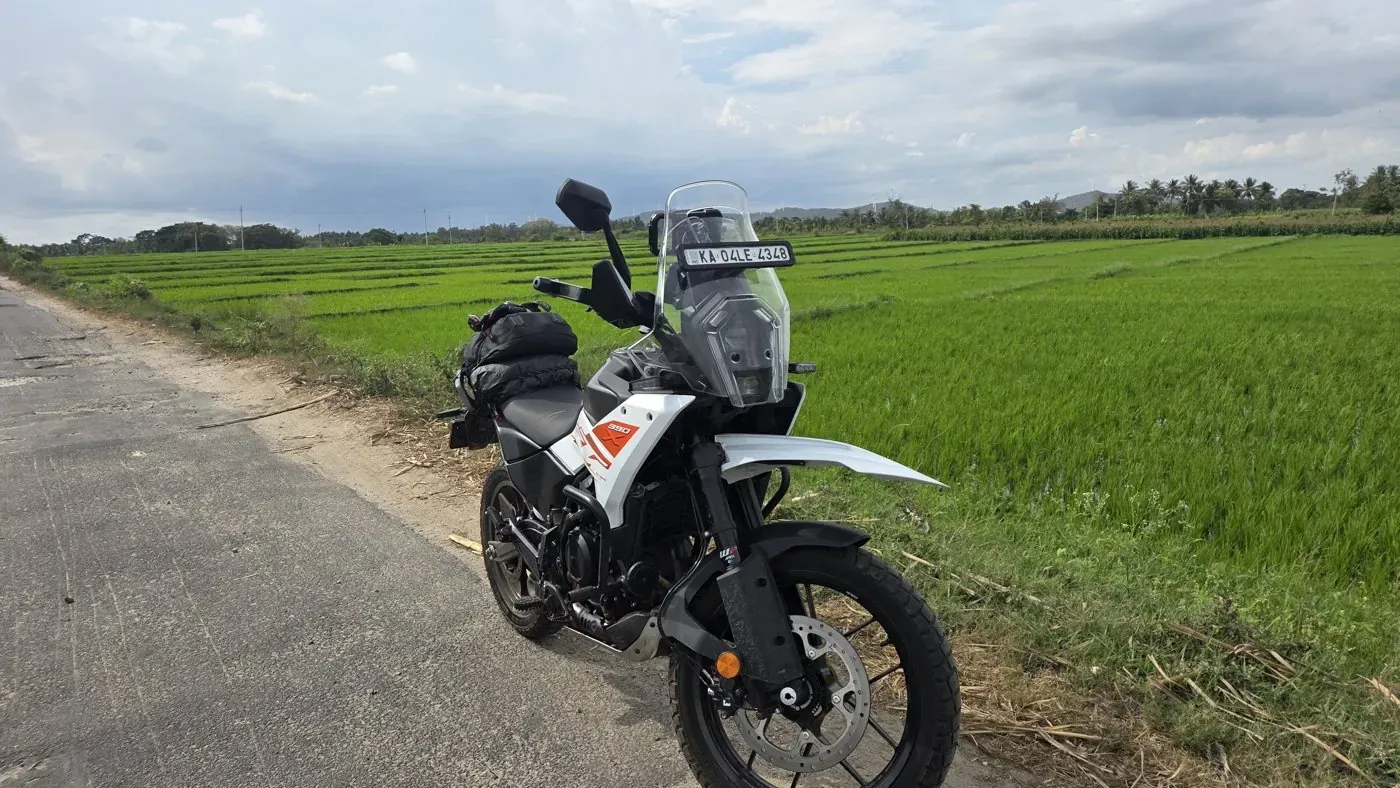
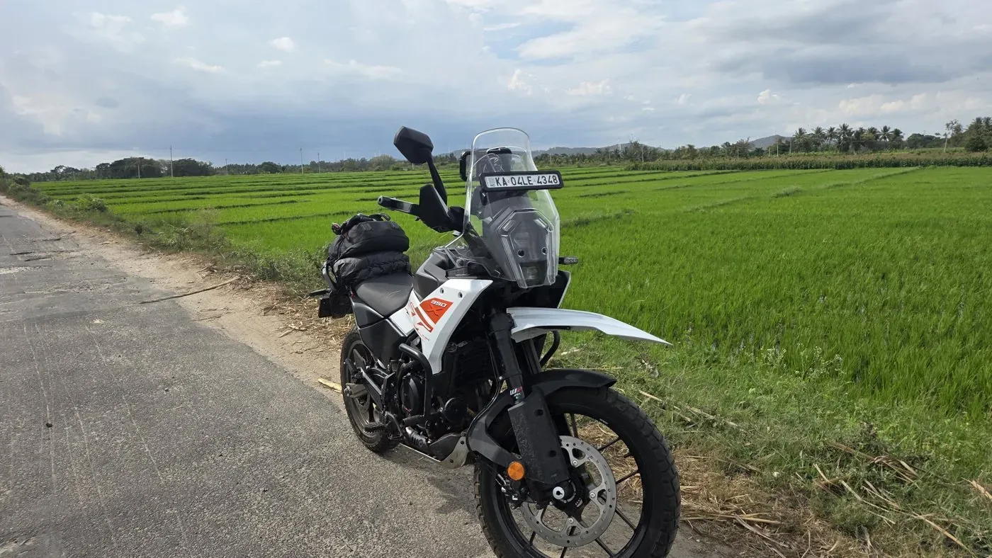
The wholeBike, road, field, sky. It tells you where. It doesn't tell you what to feel.
The machineLose the context and it becomes a portrait of the bike. Gear ad territory.
The horizonJust bands of colour. Sky, tree line, paddy. Almost abstract.
The roadTarmac edge and grass. A picture about leaving, with no bike in it.
Crop ratios: where each platform cuts your frame
Every platform crops to its own shape. Here they all sit on one of my 16:9 frames from North Bengal tea country. Pick a ratio: a vertical Reel keeps barely a third of the width, so frame the subject near the centre if you'll post it everywhere.
Width kept16:9100%3:284%4:545%1:156%9:1632%
Wider band = more of the photo. Click a colour to copy its hex, and to send it to the wheel below.
Colour: pull the palette out of any photo.
Most good-looking pictures run on three to six colours. This pulls them out live: your browser shrinks the photo onto a canvas, reads every pixel, and groups similar ones together (k-means clustering, if you want the name). Nothing leaves your screen.
Reading pixels…
Colour harmony: which colours get along.
Colour harmony is geometry on a wheel. Opposites (complementary) fight and pop. Neighbours (analogous) calm down. Three evenly spaced (triadic) feel playful. Click the wheel, use the arrow keys, or click a colour in the palette above.
Diagram: six of my frames on the colour wheel, at the main hue measured from each photo's saturated pixels. Click one to open it.
My own frames on the wheel
I measured the main hue of six of my photos and placed them on the wheel. The blue of the Kanchenjunga morning sits almost exactly opposite the orange of a lake sunset: that's why blue-and-orange frames pop. The warm three (sunset, sea of cloud, momos) sit side by side, which is why they feel calm together.
Want pop? Look for one blue thing and one orange thing.
Want calm? Keep everything inside one third of the wheel.
Editing on your phone: the order that works.
Any editor will do: the one built into your gallery app has all of these. Work top to bottom, because each step changes the next. Try the sliders on a hazy Munnar frame of mine.
A browser sketch of the idea, not a real raw editor.
Pick one. Delete the near-duplicates first. Editing five versions of the same frame is how you lose an evening.
Straighten and crop. Level the horizon, then crop to the picture inside the picture.
Exposure, then highlights and shadows. Overall brightness first; then pull highlights down and lift shadows until both have detail.
Read the detail
Contrast. A little adds punch. Haze and distance always look better with some.
White balance. Warmth and tint. Make white things white, or warm the frame on purpose.
Saturation, gently. Vibrance or saturation last, and less than you think. Skin and sky go wrong first.
Compare. Look at the original, then put the phone down for a minute and look again.
Shot checklist: ten checks before you press the shutter.
Run it in your head until it's automatic. Ticks stay in this browser so you can use it on your phone in the field.
0 of 10
Dusk, level horizon, bike on a third, and a vertical version for Reels.
Design basics: type, hierarchy and the thumbnail test.
Before anyone reads a word, the letterforms have already said something. Serif: old, literary, trusted. Sans: plain, modern, direct. Mono: built by and for machines. Type my motto, or anything, and change the voice.
Everything is. Full stop.
AVATAR
Kerning
Space between two specific letters. Hover: the A and V tuck together.
Kala
Tracking
Even spacing across a whole word. Hover to open it up. Wide caps feel expensive.
Leading is the space between lines of text. Too tight and lines collide. Too loose and they drift apart.
Leading
Named after the strips of lead between lines of metal type. Hover to loosen.
xhxh
x-height
How tall the lowercase is. Same size, very different presence: a taller x-height reads bigger.
Rg
Serif or sans
Serifs are the small strokes at the ends of letters. Hover to strip them off.
Titleand a quiet line under it
Hierarchy
Size and weight tell you what to read first. If everything shouts, nothing does.
RoadHook Touring is my riding channel and the one brand I own end to end. The method is worth stealing: write down what it is and what it never is, then check every thumbnail against it. Pick a tagline and a colour to see how they sit on midnight.
Undeniably Curious
What it is
Midnight, crimson #E0283A, cobalt #2E5BFF, neon lime #B8FF2C and white.
Strong contrast, so it holds up on a phone in daylight.
A wolf emblem. The line drawing above only sketches the idea; it isn't the mark.
Real photography from my own rides, and rounded corners.
What it never is
Orange as a primary colour.
A generic mountain logo. Half the riding world already has one, so it says nothing.
Fake-looking composites. If I wasn't there, it doesn't go in.
From raw footage to a series: the five steps
The Sikkim Diaries was a solo November 2025 ride on my NS200 that became a multi-episode YouTube series plus Reels. Five steps, raw footage to series. The full making-of is a story in Field notes.
A phone photo here is never just a photo: the bikes in the frame live on Yantra, the rides on Yatri, the truck art on Kyun, the food on Rasa, the slow looking on Manthan, and design that has to sell on Bazaar.