A Devanagari font is a set of glyphs plus a rulebook. Text is stored in spoken order, one Unicode character per sound, and a shaping engine such as HarfBuzz reads the font's OpenType rules to reorder vowel signs, swap consonants for half forms, fuse clusters into conjuncts and place marks above and below the headline. That is why Noto Sans Devanagari carries 1,117 glyphs, 566 of them with no Unicode code point at all, and why apps without a proper shaping engine still print broken Hindi.
- 1,117 glyphs in Noto Sans Devanagari, and 566 of them have no Unicode code point.
- हिन्दी is six stored characters but four or five drawn glyphs, with the i-matra moved left.
- HarfBuzz and other shaping engines reorder; the font's GSUB and GPOS rules do the rest.
- Broken Hindi in an app means no shaping engine; no font can fix it.
- Zero tracking for Hindi body text: letter-spacing breaks the shirorekha.
Latin type lets you assume three things, and Devanagari breaks all three in a single common word:
- one character is one glyph;
- glyphs are drawn in the order they are typed, left to right;
- ligatures are optional decoration.
To see how much machinery that takes, I downloaded four Devanagari fonts and two Latin fonts from the Google Fonts repository, counted their glyphs with the fontTools library, and shaped Hindi words with HarfBuzz, a widely used open-source shaping engine. The numbers below come from those files.
At the start of 1795, Charles Wilkins, the East India Company scholar who had already made Bengali type for a 1778 grammar, was living in the English countryside with time on his hands and a Sanskrit grammar to print. By his own account he cut the letters in steel, made the matrices and moulds, and cast a fount of Devanagari type himself.
Printing had barely started when fire destroyed his house and workshop. The punches and matrices survived, but most of the cast type melted or was lost on the lawn. Discouraged, he left the work for about a decade, then had new type cast from the surviving matrices and published his Grammar of the Sanskrita Language in 1808. Every conjunct he needed had to exist as a separate piece of metal, the same problem a digital font now solves with hundreds of unencoded glyphs.
The Daily Star: Bengali Types and Their Founders, Katharine Smith Diehl (from the Journal of Asian Studies, 1968)
Why is Devanagari harder to set than Latin?
Because the visual order of a syllable differs from the order its sounds are typed, and because consonant clusters change shape. A word like हिन्दी (hindī) is six Unicode characters: ह, ि, न, ्, द, ी. The short-i sign ि is typed after ह but drawn before it, and न + ् (halant) + द fuses into one conjunct shape.
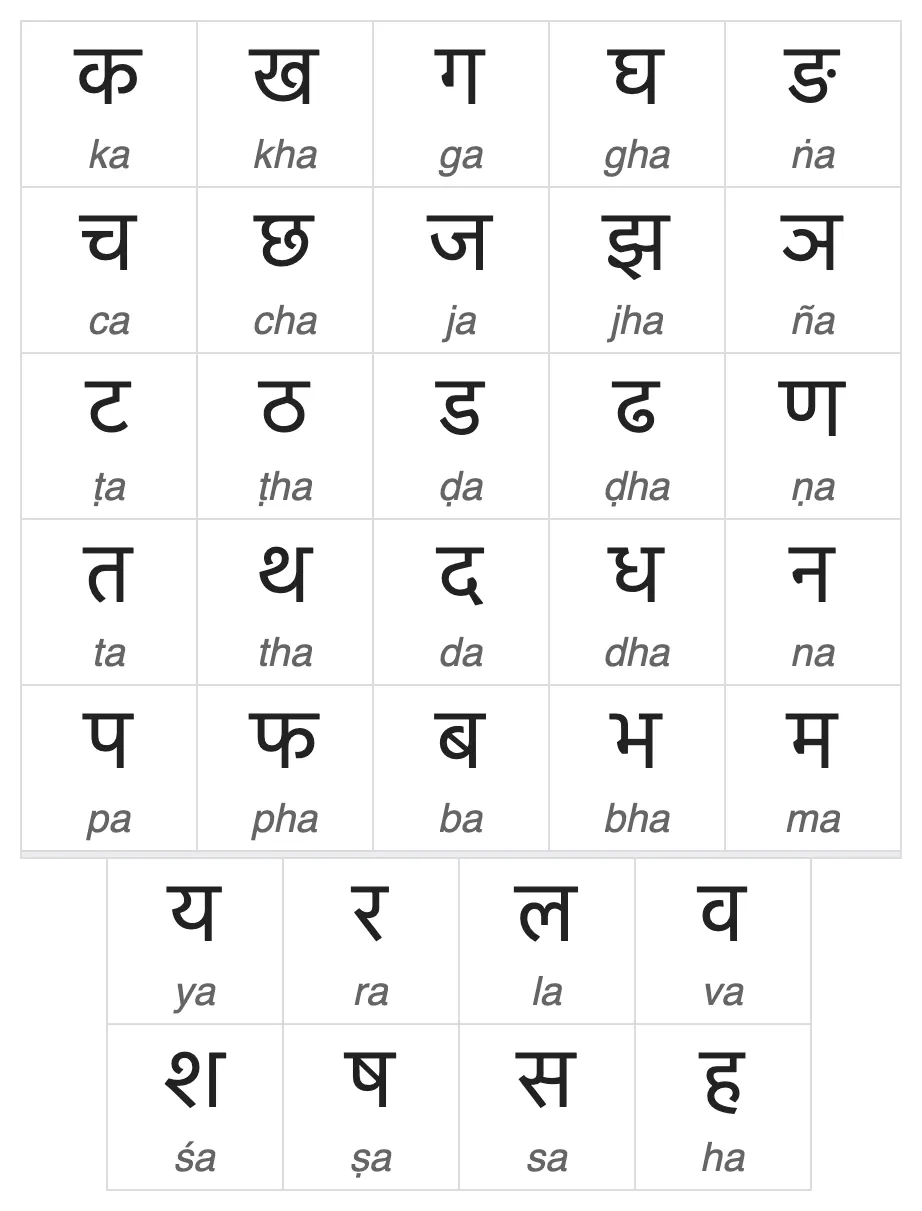
The orthographic syllable
The Microsoft specification for Devanagari OpenType fonts calls the unit that matters an orthographic syllable: once shaped, the cursor cannot be placed inside it, and no rule crosses a syllable boundary. Within it:
- one consonant is the base, normally the last one;
- consonants before it become half forms;
- a leading र becomes the reph mark on top;
- matras attach to the cluster as a whole.
Here is what HarfBuzz did with six test strings in three fonts.
| Text | Unicode characters | Glyphs: Noto Sans Devanagari | Glyphs: Mukta | Glyphs: Hind | What happened |
|---|---|---|---|---|---|
| कि | 2 | 2 | 2 | 2 | i-matra moved before क |
| क्ष | 3 | 1 | 1 | 1 | Akhand ligature kṣa |
| र्क | 3 | 2 | 2 | 2 | र became reph and moved after क |
| श्री | 4 | 2 | 2 | 2 | śra conjunct plus ī-matra |
| हिन्दी | 6 | 5 | 4 | 4 | Reordered i-matra; न्द as half-न + द or one conjunct |
| क्ष्म्य | 7 | 3 | 1 | 1 | A four-consonant cluster; Mukta and Hind draw it as one glyph |
Two lessons sit in the last column:
- Glyph counts differ by font. Each designer decides which clusters deserve a dedicated drawing and which are built from half forms.
- Reordering happens in every font. The glyph stream for कि starts with the matra, even though the stored text starts with क.

How many glyphs does a Devanagari font need?
Several hundred more than its code points. The core Devanagari Unicode block, U+0900 to U+097F, has 128 code points, but a complete text font adds hundreds of unencoded glyphs: half forms, conjuncts, reph and rakaar variants, and several widths of the short-i matra. Those extra glyphs are only reachable through OpenType rules.
See the data as a table
| Encoded (reachable by typing) (glyphs) | Unencoded (reachable only through OpenType rules) (glyphs) | |
|---|---|---|
| Noto Sans Devanagari | 551 | 566 |
| Noto Serif Devanagari | 552 | 717 |
| Mukta | 652 | 716 |
| Hind | 434 | 572 |
| Roboto (Latin) | 925 | 401 |
| Inter (Latin) | 2830 | 103 |
Source: My count with fontTools on font files from the Google Fonts GitHub repository (google/fonts), Nov 2026 · The Devanagari fonts also include basic Latin. Roboto and Inter unencoded glyphs are mostly alternates, small caps and accents.
The contrast is the point. Inter, a large Latin family, has 2,933 glyphs but only 103 without a code point (my count with fontTools on the Inter file in the Google Fonts repository, Nov 2026), because Latin rarely needs context to pick a shape.
Every Devanagari font in the sample keeps more than half its glyphs behind rules.
Every Devanagari font in the sample keeps more than half its glyphs behind rules. Noto Sans Devanagari has 345 glyphs whose names show they are built from consonant plus halant sequences, and 16 different widths of the short-i matra, so the matra's curl can reach over clusters of different widths.
| Font | Units per em | Total glyphs | Code points | Devanagari block code points | Short-i matra variants |
|---|---|---|---|---|---|
| Noto Sans Devanagari | 1,000 | 1,117 | 551 | 128 of 128 | 16 |
| Noto Serif Devanagari | 1,000 | 1,269 | 552 | 128 of 128 | not counted |
| Mukta | 1,000 | 1,368 | 652 | 127 | 24 (including ligated forms) |
| Hind | 1,000 | 1,006 | 434 | 94 | 33 (including ligated forms) |
Block coverage is not language support
Coverage of the block is not the same as support for a language. Hind leaves 34 of the 128 code points out: Vedic stress marks, short e and o vowel letters, and extra letters for languages such as Kashmiri, Sindhi and Marwari (for example ॻ, ॼ and ॸ). That is fine for modern Hindi and Marathi but not for Vedic texts or those languages. Noto adds 42 code points from the Devanagari Extended blocks for those.
What does the shaping engine actually do, step by step?
It breaks text into syllables, finds the base consonant, reorders, then applies the font's GSUB features in a fixed order and finally positions marks with GPOS. The order is defined by Microsoft's Indic specification and implemented by HarfBuzz, Uniscribe/DirectWrite and Apple's CoreText; the font designer writes rules that assume it.
- Analyse the syllable. Classify each character (consonant, matra, halant, nukta) and find the base: start at the end and move back until reaching a consonant without a below-base or post-base form.
- Initial reorder. Move pre-base matras such as ि (class "BeforeHalf") ahead of the cluster. Reph stays at the start for now.
- Localised forms. Apply 'locl' for language-specific shapes, for example Marathi versus Hindi variants.
- Basic shaping forms, one at a time: 'nukt' (nukta forms), 'akhn' (required ligatures like क्ष and ज्ञ), 'rphf' (reph), 'rkrf' (rakaar ligatures), 'blwf' (below-base forms), 'half' (half forms), 'vatu' (vattu ligatures) and 'cjct' (conjuncts).
- Final reorder. Move the matra to sit just before the main consonant now that half forms are known, and move reph to its final position after the main consonant.
- Presentation forms, on the whole cluster: 'pres', 'abvs', 'blws', 'psts', 'haln' and 'calt', which pick the right width of ि, fuse matras with consonants and handle a final halant.
- Positioning (GPOS): 'kern' and 'dist' for spacing, 'abvm' and 'blwm' to anchor marks above and below.
The specification is blunt about why the engine and not the font does the reordering: encoding it as font substitutions would take "a huge number" of many-to-many mappings. The new-style script tag for this behaviour is 'dev2'; the older 'deva' tag kept a different, now legacy, reordering model. Every Devanagari font I opened lists exactly these features, from 'abvs' and 'akhn' to 'rphf' and 'vatu'.
This preprint tackles the problem this post describes from the generation side: Indic fonts need hundreds to thousands of conjuncts, half forms and matra variants that must stay mutually consistent under OpenType shaping, so drawing glyphs one by one with AI fails. Srijika instead takes shaping-complete template fonts for Devanagari, Tamil, Bengali, Telugu, Kannada, Malayalam, Gujarati, Gurmukhi and Odia, keeps their cmap, GSUB and GPOS, and only restyles outlines with a diffusion model.
It produced 66 fonts that all passed the OpenType Sanitizer, and its audit covered 80,915 glyphs and 54,812 anchors. On held-out families, plain template copying beat generation on 50 of 56 faces by its SSIM gate. The limit: no human reading study, and the author warns that the style-change metric shares training data with the test families.
Read the paper (free)Why do some apps still show broken Hindi?
Because they skip shaping. Software that maps characters straight to glyphs through the cmap, without running a shaping engine, draws the stored order: the ि matra lands after its consonant, every halant shows as a visible stroke, and no conjuncts form. The text is correct; only the rendering is wrong, which is why copying it into a browser fixes it.
The usual culprits are tools with their own text renderers: some game engines, older design apps whose Indic support was optional, embedded displays, and PDF generators that subset fonts without their layout tables.
Three-string shaping test
- Type कि. The matra should sit on the left.
- Type क्ष and ज्ञ. Each should become a single conjunct.
- Type र्क. The reph should sit above, at the right of क.
Does Devanagari text read differently from Latin text?
Brain imaging suggests it does, and the extra visual complexity is the likely reason. Devanagari is an alphasyllabary: partly alphabetic, partly syllabic, with marks above, below and to the left of the base, so word recognition has to work in two dimensions rather than along a line.
Sixteen native Hindi readers aged 21 to 50 (5 women, 11 men) read aloud 240 Devanagari words in a 3 T fMRI scanner. Half were visually linear words with no marks above or below the line, like फल, and half were non-linear, with at least one diacritic or conjunct, like फूल or किरण; each set mixed high- and low-frequency words. Accuracy was high (mean 97.6%).
Reading activated occipito-temporal, inferior frontal and precentral regions in both hemispheres and both sides of the cerebellum, a bilateral network, unlike the mainly left-hemisphere network reported for alphabetic scripts. Non-linear words differed from linear ones mainly in right temporal areas and the cerebellum. The authors attribute the extra activity to the visuospatial demands of the script. The limit: 16 participants, and comparisons with Latin come from other studies rather than the same subjects.
Read the paper (free)For designers, the practical reading is that Devanagari needs room to breathe vertically. Its marks extend well above the headline (reph, ई and ए matras, chandrabindu) and below the base (ु, ू, rakaar), so line spacing that suits Latin often clips or crowds Hindi.
Noto Sans Devanagari's ascender and descender metrics are 896 and −408 units, a span of 1.30 em before any extra leading.
Pair Hindi and English on one page and the leading has to be set for the Devanagari. I work through that in bilingual Hindi-English layout.
Can you letter-space or kern Devanagari like Latin?
You can kern it but should not track it. Devanagari fonts do use the 'kern' and 'dist' features, but sparingly: Noto Sans Devanagari has 486 individual kerning pairs and 322 non-zero class pairs, against 13,472 individual pairs in Inter (my counts with fontTools on the files in the Google Fonts repository, Nov 2026). The shirorekha, the headline that joins letters into a word, is designed to run continuously, so adding letter-spacing breaks it into islands.
That difference is why the Latin spacing toolkit in kerning, tracking and leading explained transfers only partly. Word spacing still works normally; letter-spacing should stay at zero for Hindi body text. If you need a condensed headline, choose a condensed Devanagari design instead of squeezing a regular one.
Which Hindi fonts match condensed Latin display faces?
The answers on the Graphic Design Stack Exchange thread asking for a Devanagari match to Impact, Oswald and Anton point to Teko and Khand on Google Fonts and to Typotheque's November and its rounded sibling October, which have condensed and compressed widths.
The underlying problem is that Latin display faces get their punch from tall, narrow stems, while Devanagari letters are wider than tall and share a headline, so a "condensed" Devanagari has to be redrawn rather than squeezed. I rank the open options in Indian script fonts on Google Fonts, ranked.
What's new
- SIL releases Annapurna SIL 3.000 with Medium and SemiBold weights and new Devanagari Extended-A signs INDOLOGY list (SIL Font News), Jun 2026
- TypeTogether releases Bree Devanagari, designed by a team led by Pooja Saxena TypeTogether, Mar 2026
- Unicode 17.0 adds 4,803 characters, including the Tolong Siki script and a Sharada Supplement block Unicode Consortium, Sep 2025
Questions people ask
Why does Hindi text look broken when I paste it into some apps?
The app is drawing characters in stored order without a shaping engine. The i-matra appears after its consonant and conjuncts fall apart into consonants with visible halants. Use software with HarfBuzz, DirectWrite or CoreText shaping, or export the text as outlines from an app that shapes correctly.
Is Unicode Devanagari the same as a Hindi font?
No. Unicode defines the 128 characters of the main Devanagari block and their order; the font supplies shapes and the rules that turn character sequences into conjuncts and reordered marks. The same Unicode text can look quite different, and form different conjuncts, in two fonts.
Why are Devanagari fonts larger files than Latin ones?
Because of the unencoded glyphs and the rule tables. In my sample, more than half of every Devanagari font's glyphs were conjuncts, half forms and matra variants that only exist to be substituted in by GSUB rules, and each of those rules takes space too.
What does dev2 mean in a font?
It is the OpenType script tag for the current Indic shaping model for Devanagari. Older fonts used 'deva', which followed an earlier reordering behaviour. Modern engines support both, but new fonts should use 'dev2'.
Sources
- The Daily Star: Bengali Types and Their Founders, Katharine Smith Diehl (reprinted 2021 from the Journal of Asian Studies, 1968; Wilkins's Devanagari type, 1795 to 1808)
- Microsoft Typography: Developing OpenType Fonts for Devanagari Script (shaping stages, feature order, reordering classes, dev2 tag)
- Unicode Consortium: Devanagari code chart, U+0900 to U+097F
- HarfBuzz documentation
- Google Fonts GitHub repository (Noto Sans Devanagari, Noto Serif Devanagari, Mukta, Hind, Roboto, Inter; my counts with fontTools and HarfBuzz, Nov 2026)
- Google Fonts: Noto
- Anil Pai: Srijika: OpenType-Layout-Reusing Font Restyling for Nine Indic Scripts, arXiv (2026)
- Singh and Rao: Reading in Devanagari: Insights from functional neuroimaging, Indian Journal of Radiology and Imaging (2014)
- Unicode 17.0.0 (2025) and Unicode 16.0.0 (2024)
- SIL Font News via INDOLOGY: Release of Annapurna SIL v3.000 (2026)
- TypeTogether: New release, Bree Devanagari (2026)
- Graphic Design Stack Exchange: Is there a Hindi (Devanagari) font style that matches Impact, Oswald and Anton?
- Graphic Design Stack Exchange: Problems while creating fonts for different scripts
- Graphic Design Stack Exchange: Is there a non-Latin "pseudo-Latin" font?

Sapta (Saptarshi Sarkar) is a mechanical engineer turned marketer in Bengaluru and a solo touring rider. He writes the seven Saptaverse blogs. Work with him or read more of Artblog.